Architecture Summer Intensive 2020
Exhibition: False Creek + the Architecture of Resilience
Full scholarship provided by:

Artists
Robyn Goh
Camille Gratton
Helveg Lam
Samantha Lu
Chase Matthews
Fiona Nixon
Daniel Russell
Tara Sangra
Joshua Taylor
Ghazal Torkaman
Deqa Youssouf
Lead Artists
Graham Smith, Architect AIBC
Netsanet Tsegaye
Guest Artists
Amy Nugent, Executive Director, Urbanarium
Surabhi Shakkarwar, Urbanarium Studio Artist
Kristen Elkow, Urbanarium Studio Artist
Neda Roohnia, Urbanarium Studio Artist
Stina Hanson, Urban Planner, City of Vancouver
Angela Danyluk, Biologist/Sustainability Specialist, City of Vancouver
Dustin Dilts, Landscape Architect, PFS Studio
Bryan He, Intern Architect AIBC, Human studio
Curators
Roxanne Gagnon, Artistic Director, Art & Design, Arts Umbrella
Jocelyn Sanchez, Coordinator, Art & Design, Arts Umbrella
About the Program
The learning objectives of the “False Creek + the Architecture of Resilience” project were to expose students to the multi-layered urban design and architectural challenges and opportunities related to sea level rise. To that end, we selected a waterfront industrial site in South False Creek as our site. As one of the last undeveloped sites on False Creek, it is a natural locus for developing ideas about resilience, design adaptation, and optimization for sea level rise.
A variety of experts presented their perspectives to the students, including a biologist, landscape architect, and urban planners. All to contribute to the students’ overall understanding of design issues related to our site.
The class then engaged in an urban scale exercise to zone and plan the site with reference to lessons about water management and stewardship, day-lighting underground streams, urban access and connectivity, neighbourhood context, off-grid self-sufficiency, and various other drivers that manifest themselves in a resilient design response.
Once the site plan was developed, each student designed a building in response to the plan and its parameters. Over the course of their design work, students were provided with ongoing advice and technical support by the faculty and guests. The students were encouraged to incorporate various (and redundant) resilient strategies into their designs to ensure that their projects are able function individually, while relating to their immediate and surrounding urban setting.
Throughout the process, students were also asked to examine the integration of resilience into the overall composition, function, and appearance of their designs, keeping architectural design and aesthetic in mind. Compositional elements include form, orientation, colour, and material, all of which were to be used consciously and deliberately. Their learning objective was to see architecture as a functional, three dimensional art form in which all components are examined and used to serve the design intention of any given building. Finally, once their designs were complete, the students reconvened for discussion and critique.
Robyn Goh
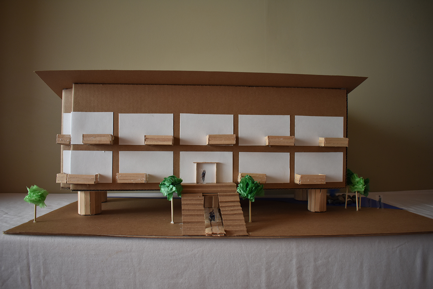
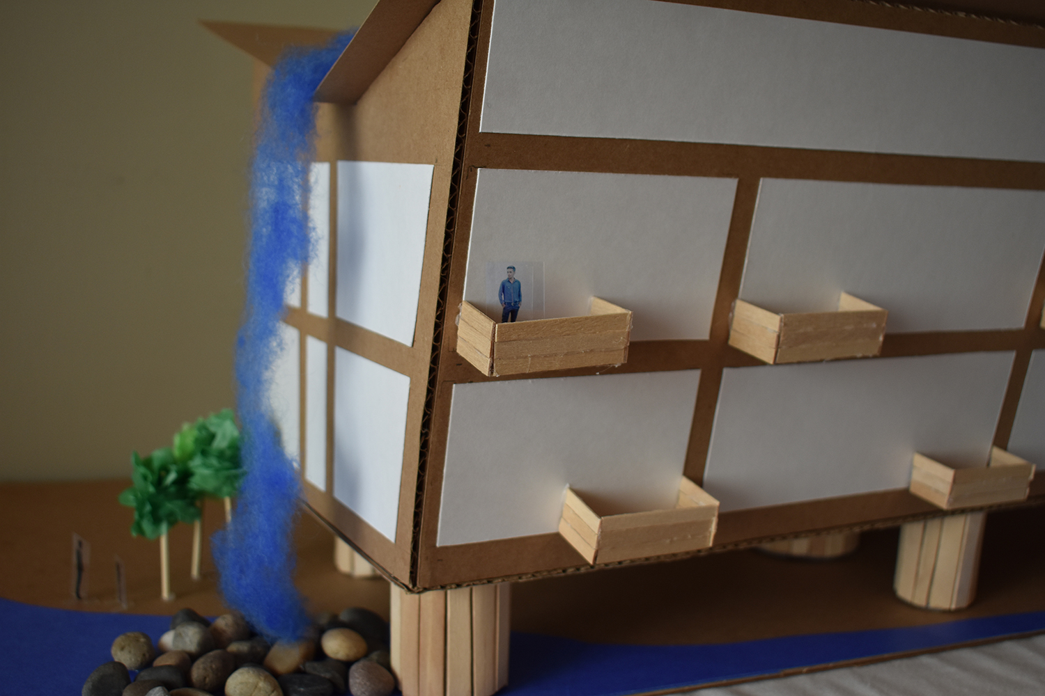
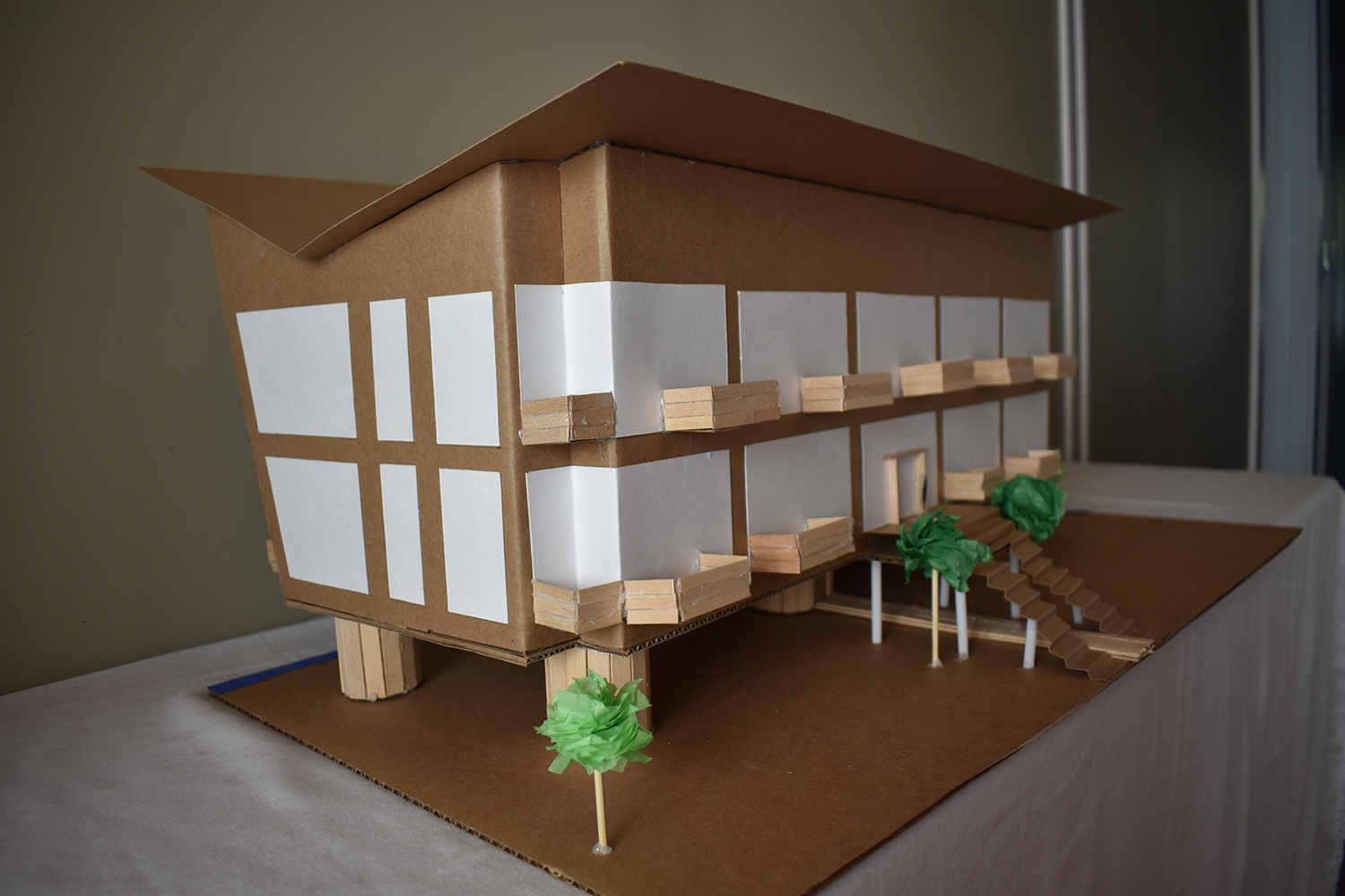
Model of Low-Rise Residential Building (2020)
Mixed materials, 61 x 26 x 22 cm,1:60
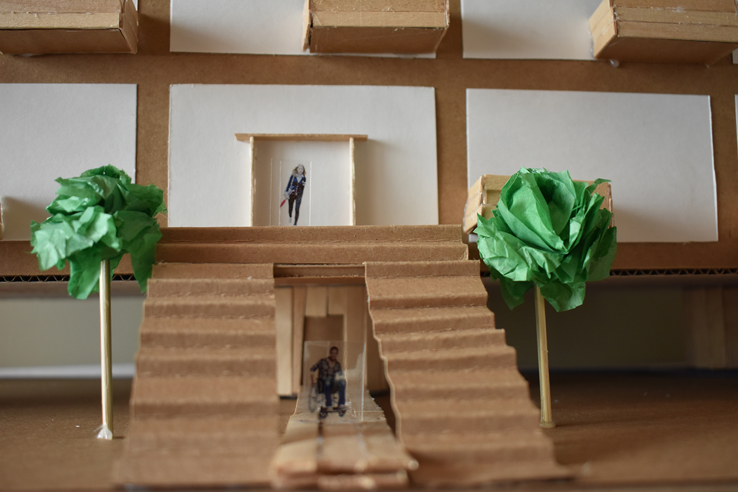
This low rise residential building was designed on stilts over a human made lake to accommodate predicted rising sea levels. While the building evolved throughout the design process, I always focused on accessibility, sustainability and a cohesive look. The building has a core elevator that extends to the ground as an accessible entrance for wheelchair users and older residents.
It was originally planned to have a ramp, but to have an accessible grade it would be too long for the property. Sustainability is demonstrated with the floor to ceiling windows that maximize natural light, as well as the rain sourced waterfall on the side of the building. The structure incorporates many wooden elements along with diagonal lines in the slanted wall and butterfly roof.
Camille Gratton
Cube complex (2020)
Cardboard, paper, plastic, sharpie, wood sticks and tissue paper, 60 x 46 x 50 cm
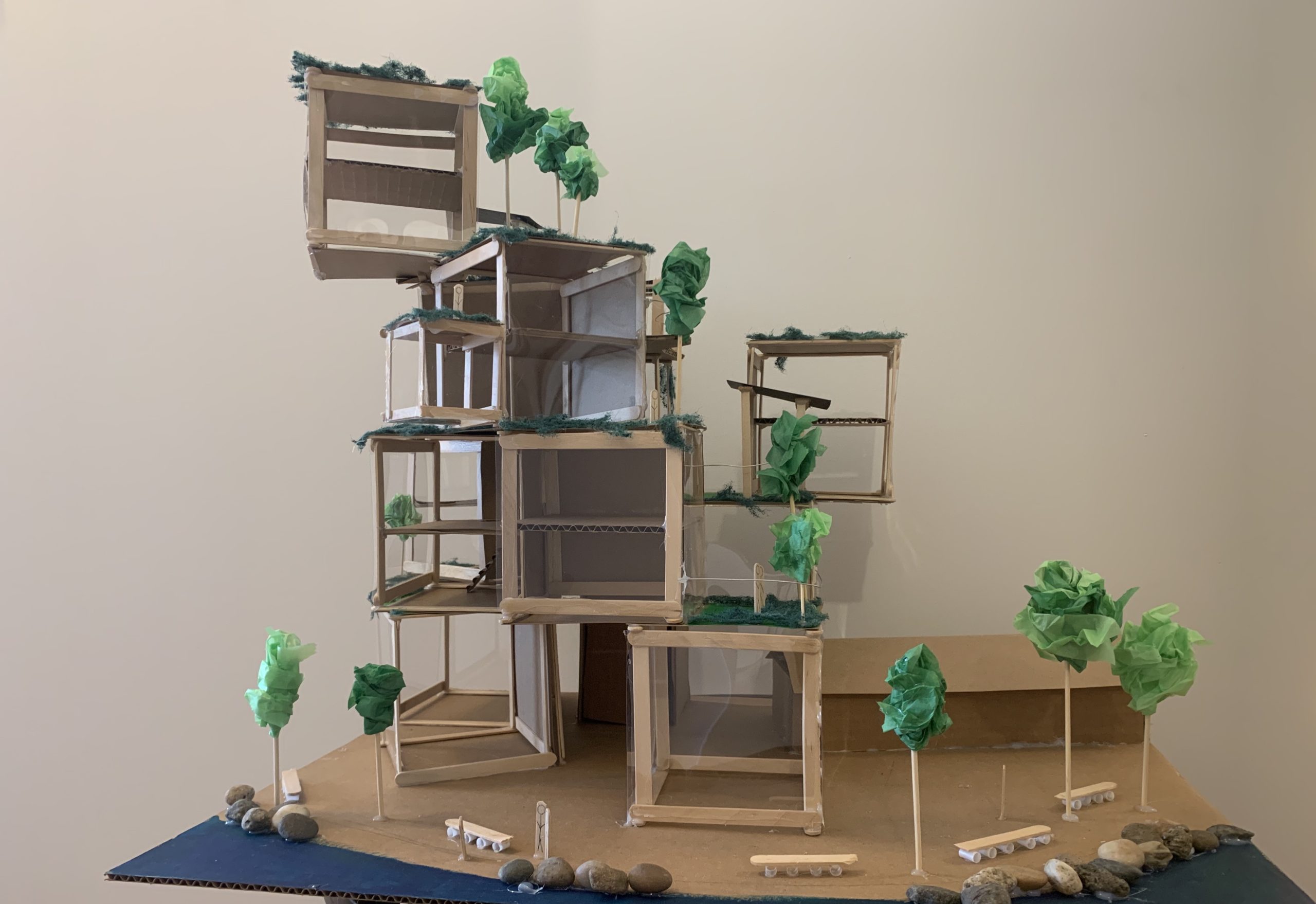
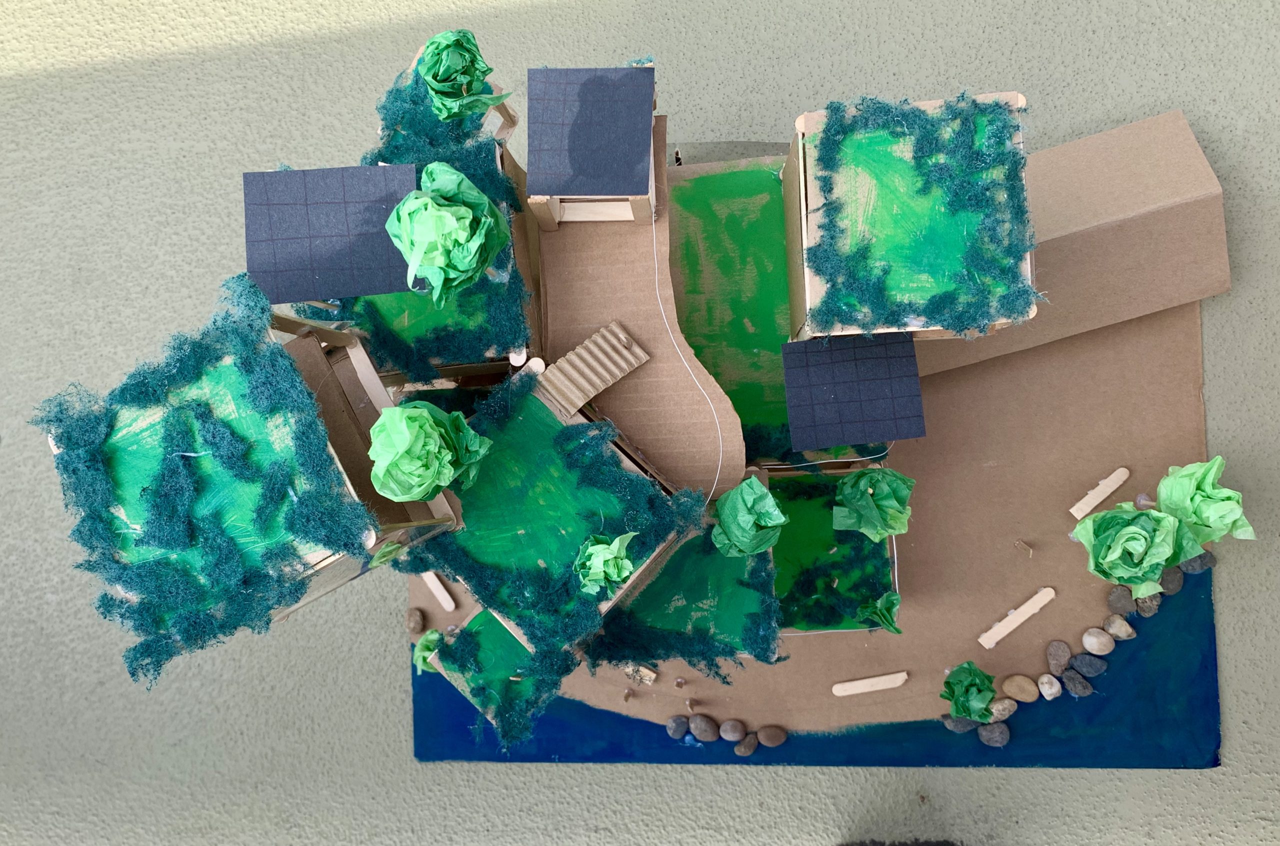
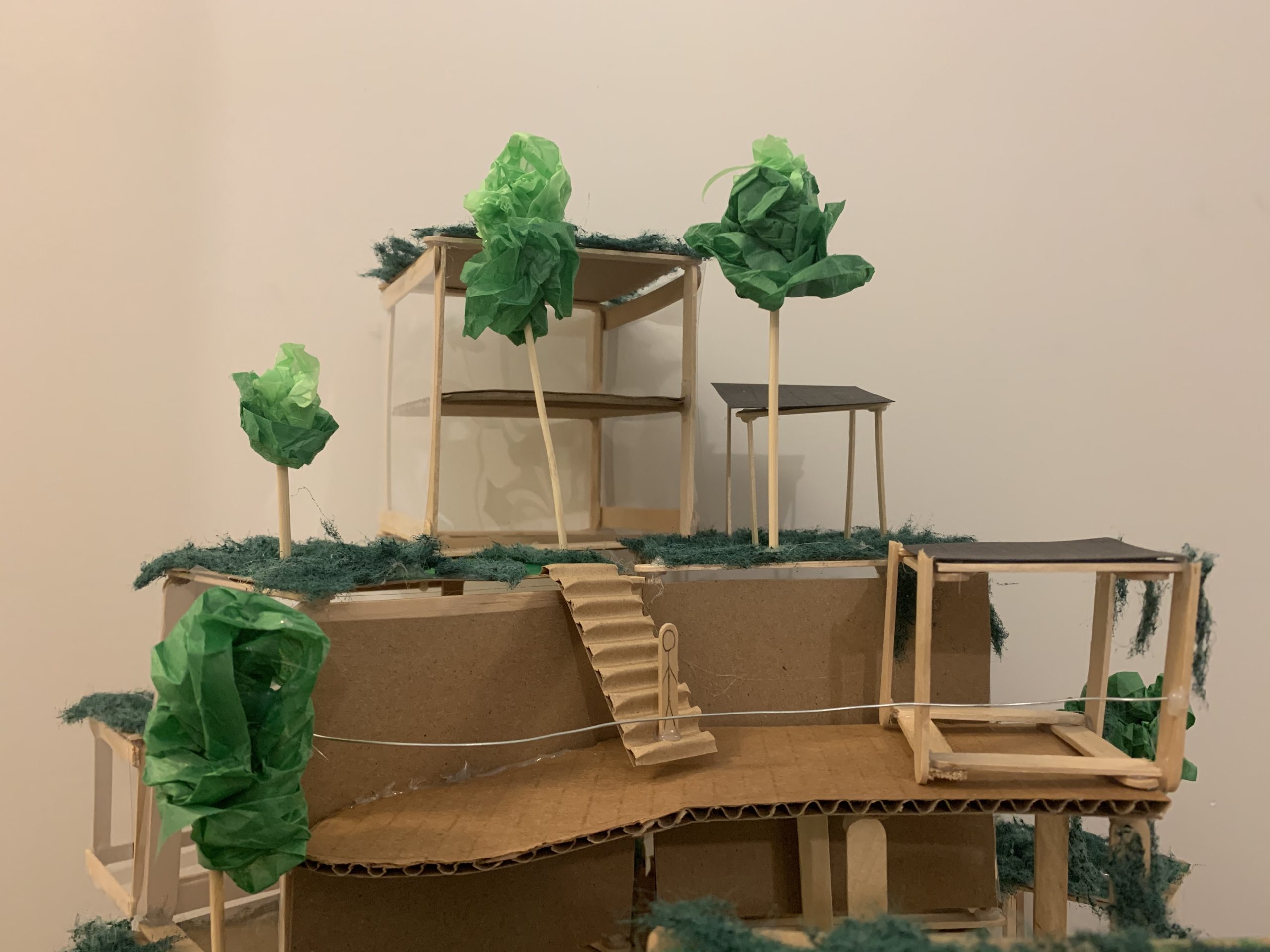
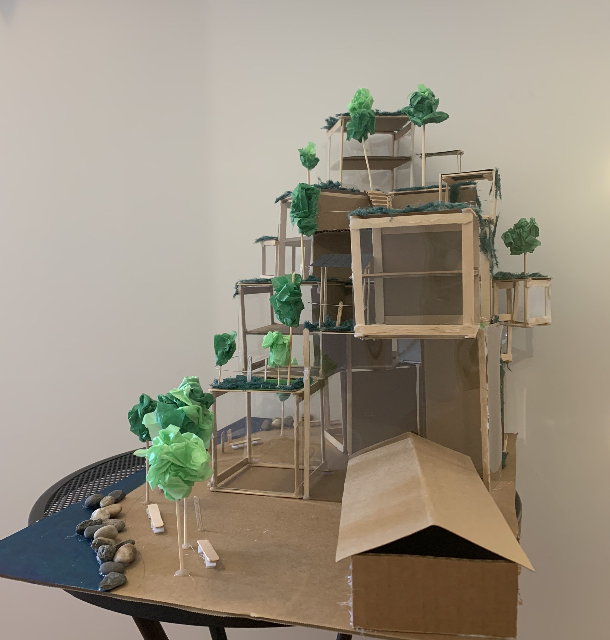
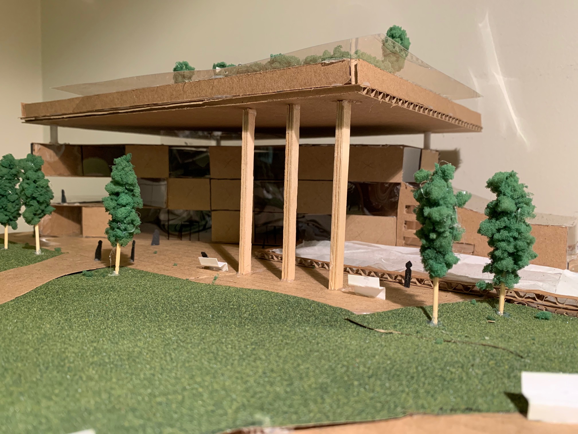
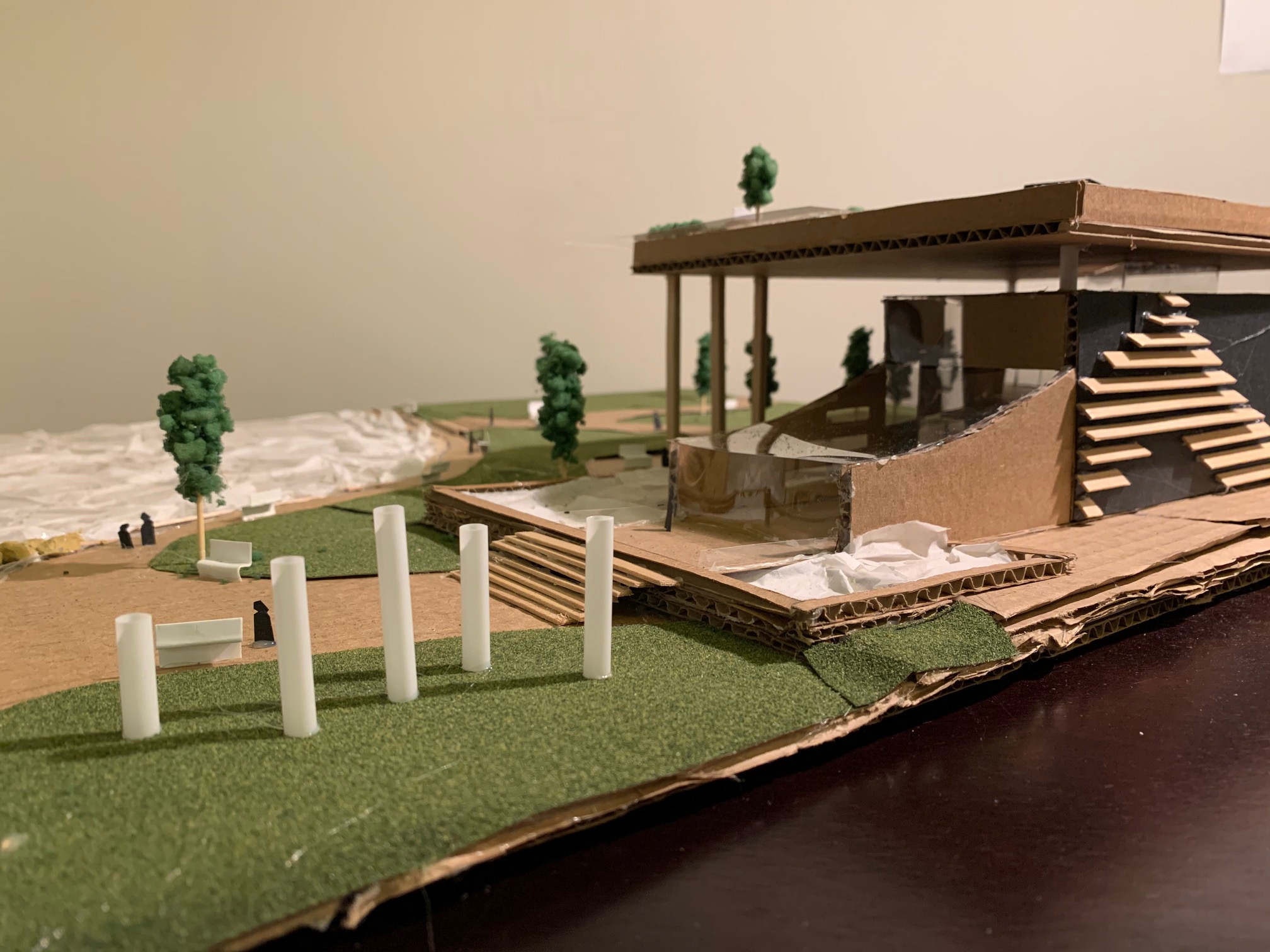
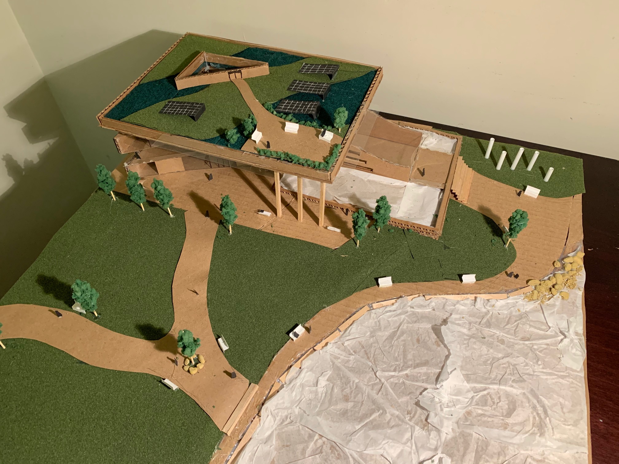
The mixed-use residential and commercial building that I have constructed was designed with future sea level rise, resilience and sustainability taken into consideration. For this building to be resilient to sea level rise, the building and the deck around it will be raised on stilts to allow for extra water to collect underneath. In addition, a river and small lake were added to the land, to allow water into the site, helping to partially divert it away from the building.
Green roofs, which can be used for urban agriculture and recreational spaces, as well as solar panels and green walls, were added with the natural environment around in mind, and all contribute to the sustainability of this building. The synthesis between the rigid geometric cubes, the free-flowing nature of the ocean and river, and the organic, natural forms of the plants on the green roofs will make this building stand out from the ones around it, while also fitting in harmoniously with the natural elements around it.
Helveg Lam
Building on a Stream (2020)
Cardboard, 99 x 61 x 24 cm
This building was created with the idea of integrating man-made structures with nature to create a sustainably and unique looking building. The model is elevated from the ground and placed above a stream to combat the rising water levels and to allow pedestrians to cross the stream.
The green roofs of the building are connected to the ground which allows the building to have a natural insulator and gives the people space to hang out. Large windows are placed on the north side of the building to provide the residents with a view of the mountains.
Samantha Lu
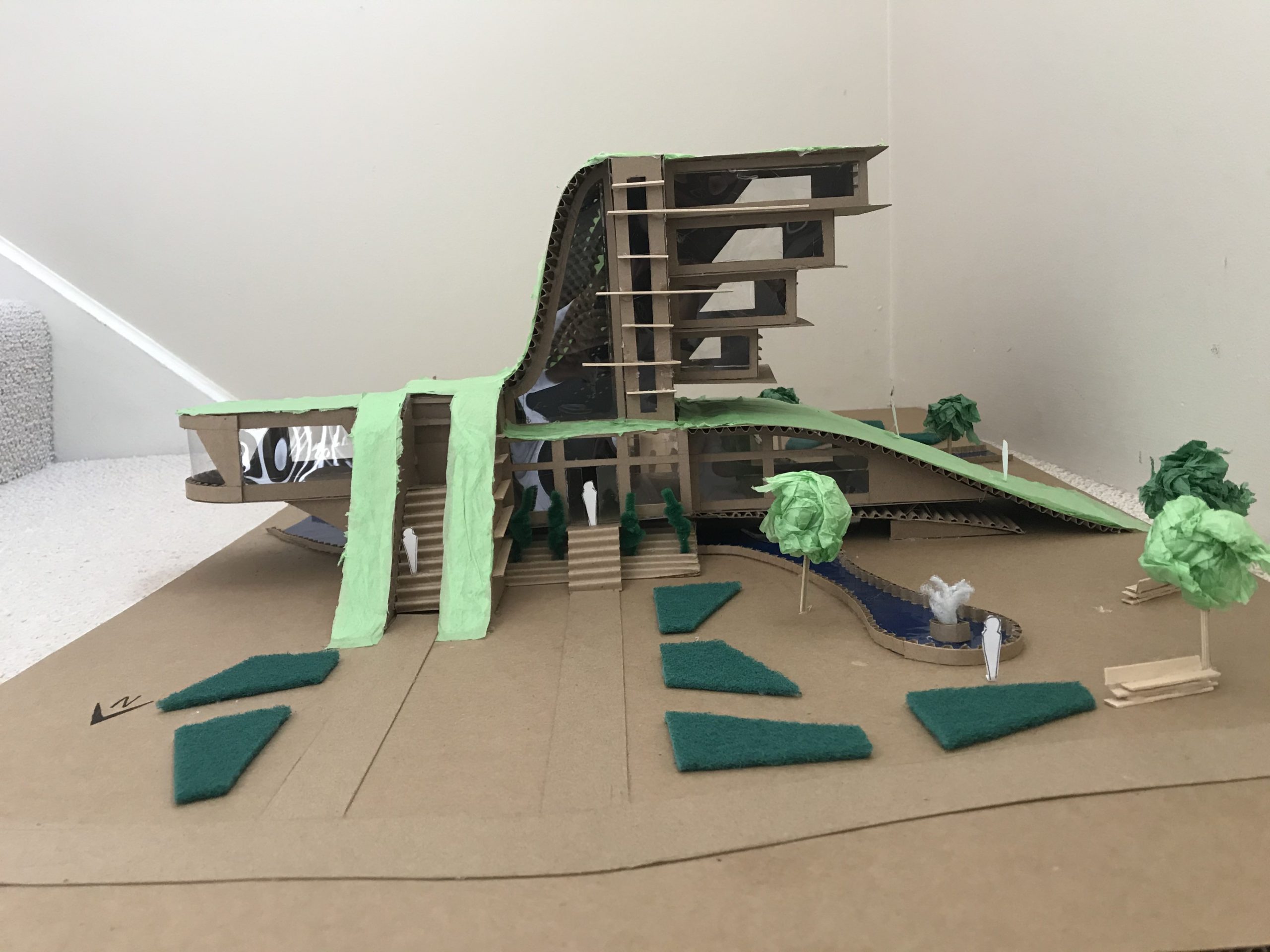
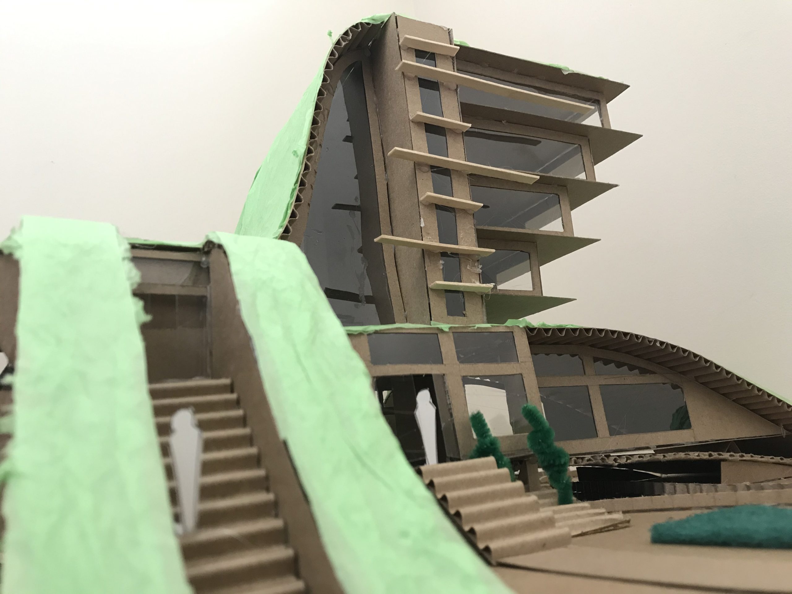
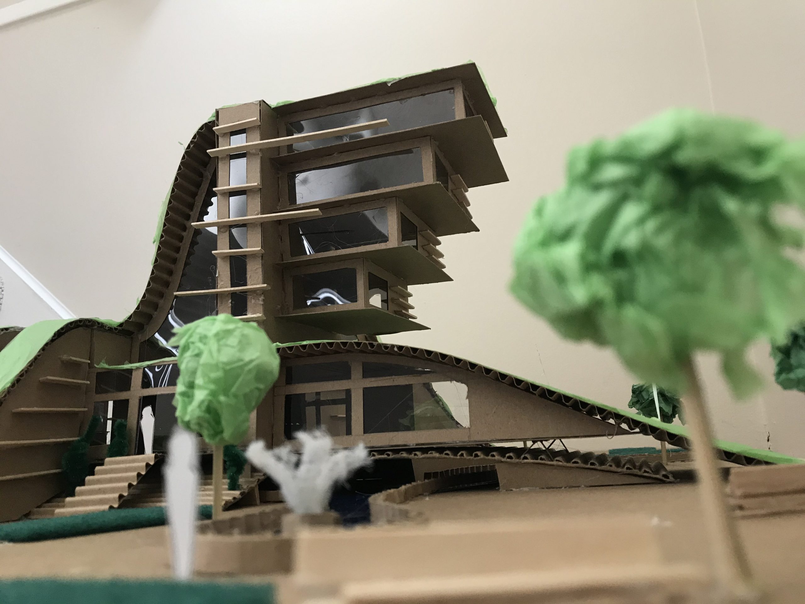
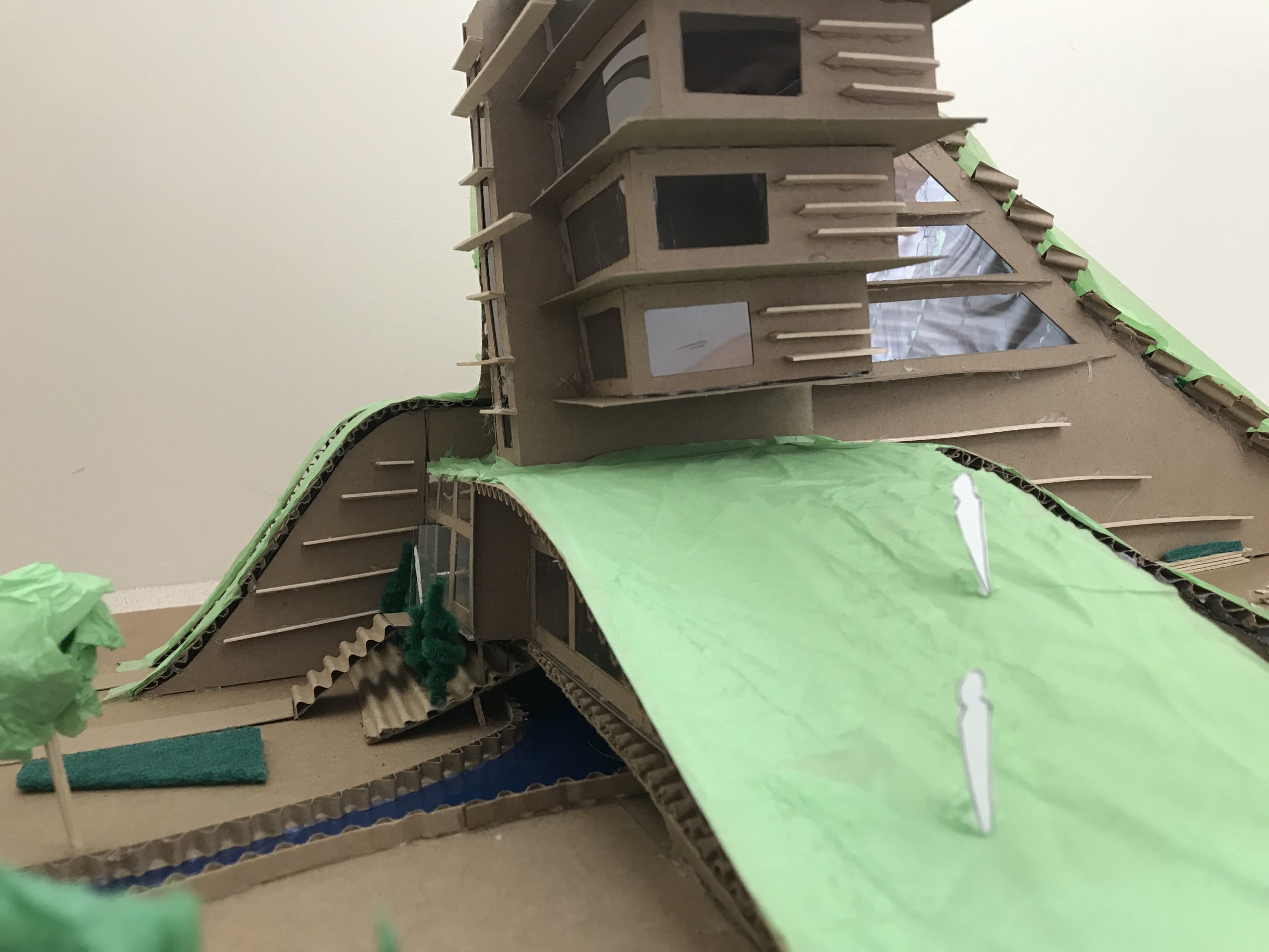
This is a model of a practical, contemporary, and environmental commercial centre (or shopping mall) that incorporates its surroundings as part of its design. With its placement at the corner of a park built specifically to contain the inevitable sea level rise of the Fraser River, visitors can enjoy a dazzling view of greenery and water while engaging in their shopping activities.
The intentional curvature of the building around the field’s edges also enhances this experience. Overall, the mall consists of 3 floors, roof parking with access to the Cambie bridge, a spacious food court with glass ceilings, a plant-filled atrium that carries throughout the levels, and finally a greenspace on the very top with seating that overlooks the whole park.

Chase Matthews
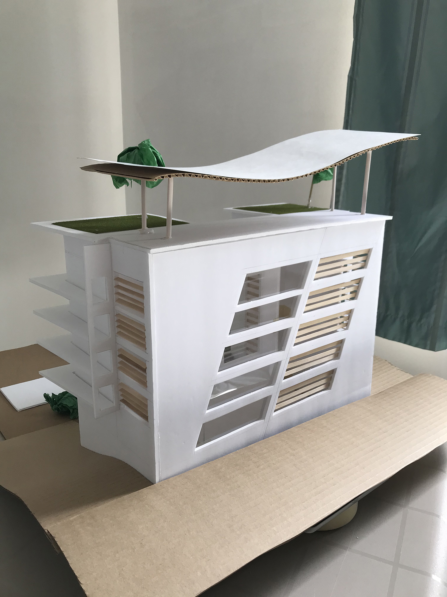
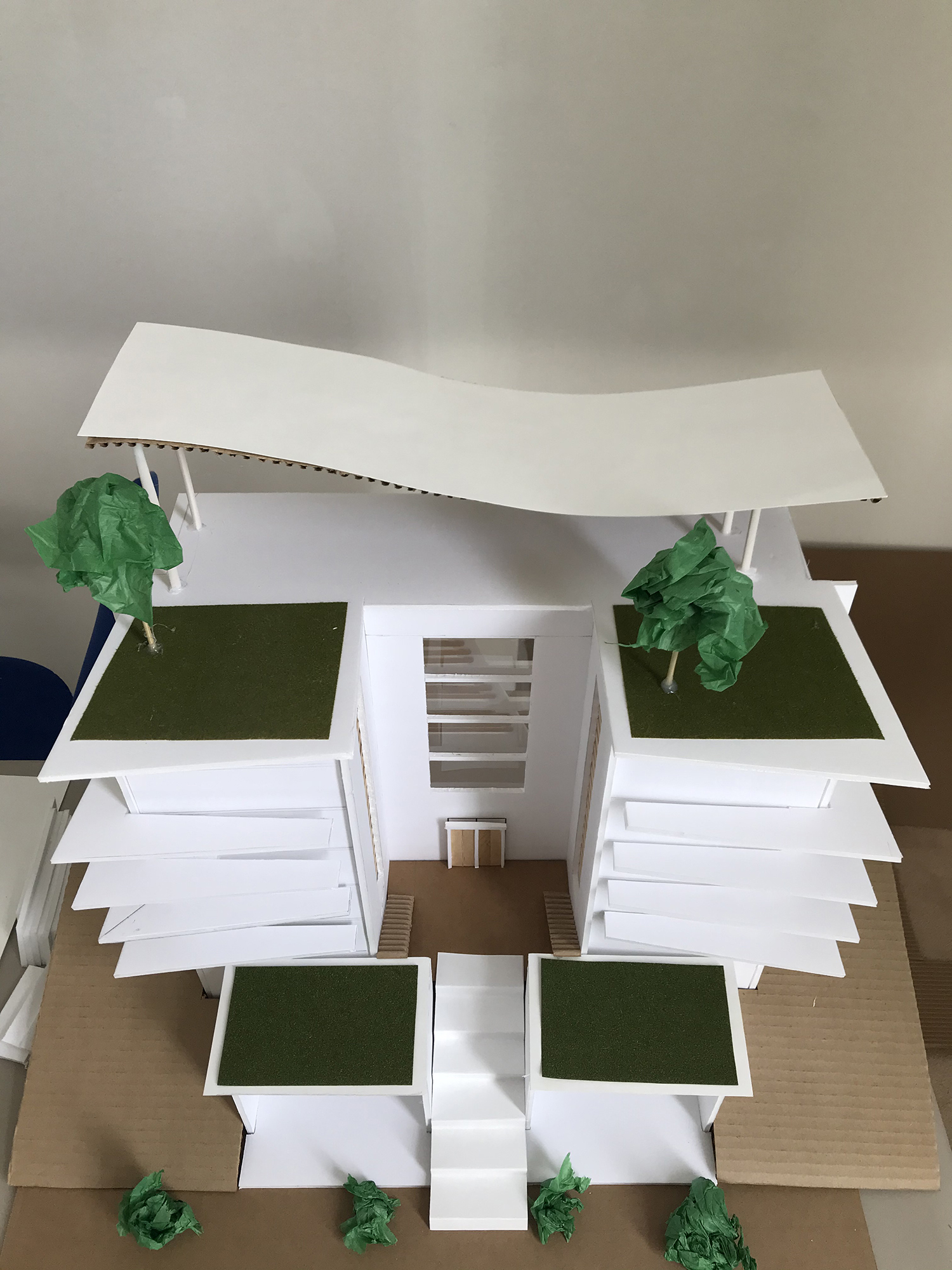
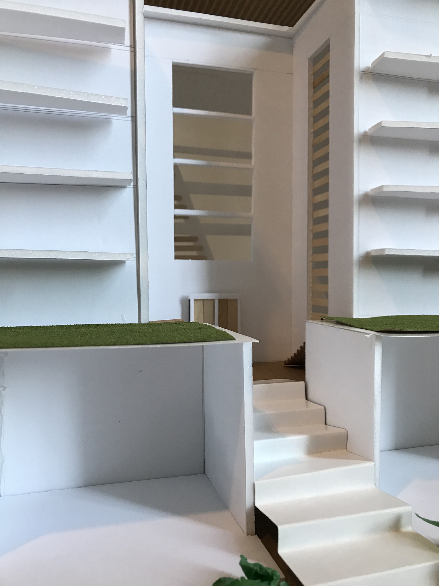
This building was designed to be a mixed use space, merging residential condominiums with commercial retail space within in the same unit. The two smaller buildings in the front will act as the commercial retail space, and could be a store front, cafe, restaurant, and more, while the larger building behind will be housing.
An elevation gain is present, with a staircase which leads to a courtyard area. The elevation gain can also act as a buffer to rising sea levels, along with the river-fed lake in the middle of the site. Both the residential and retail buildings have accessible green roofs, as well as some rooftop trees and other vegetation.

Fiona Nixon
Mixed Use Hub (2020)
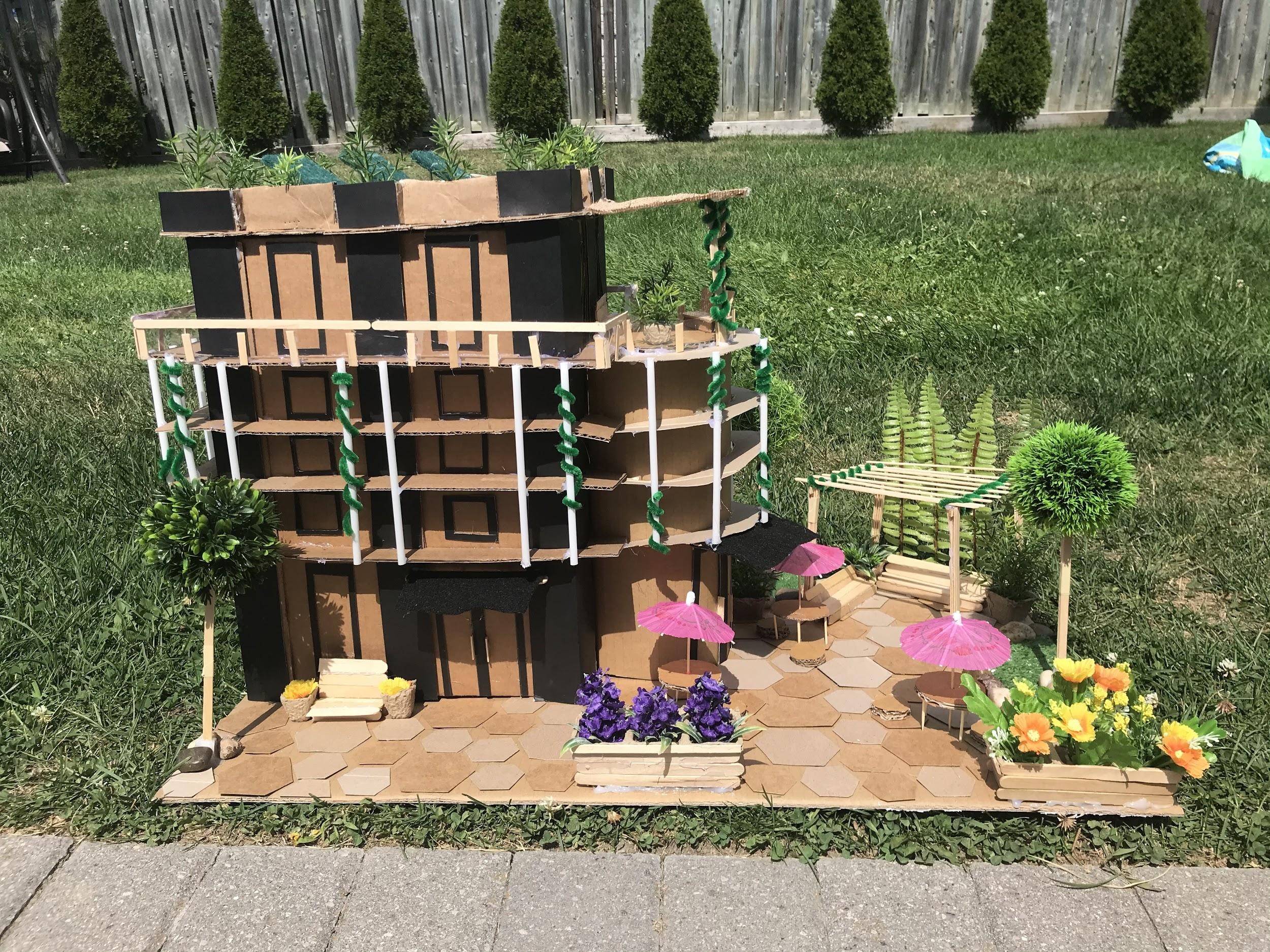
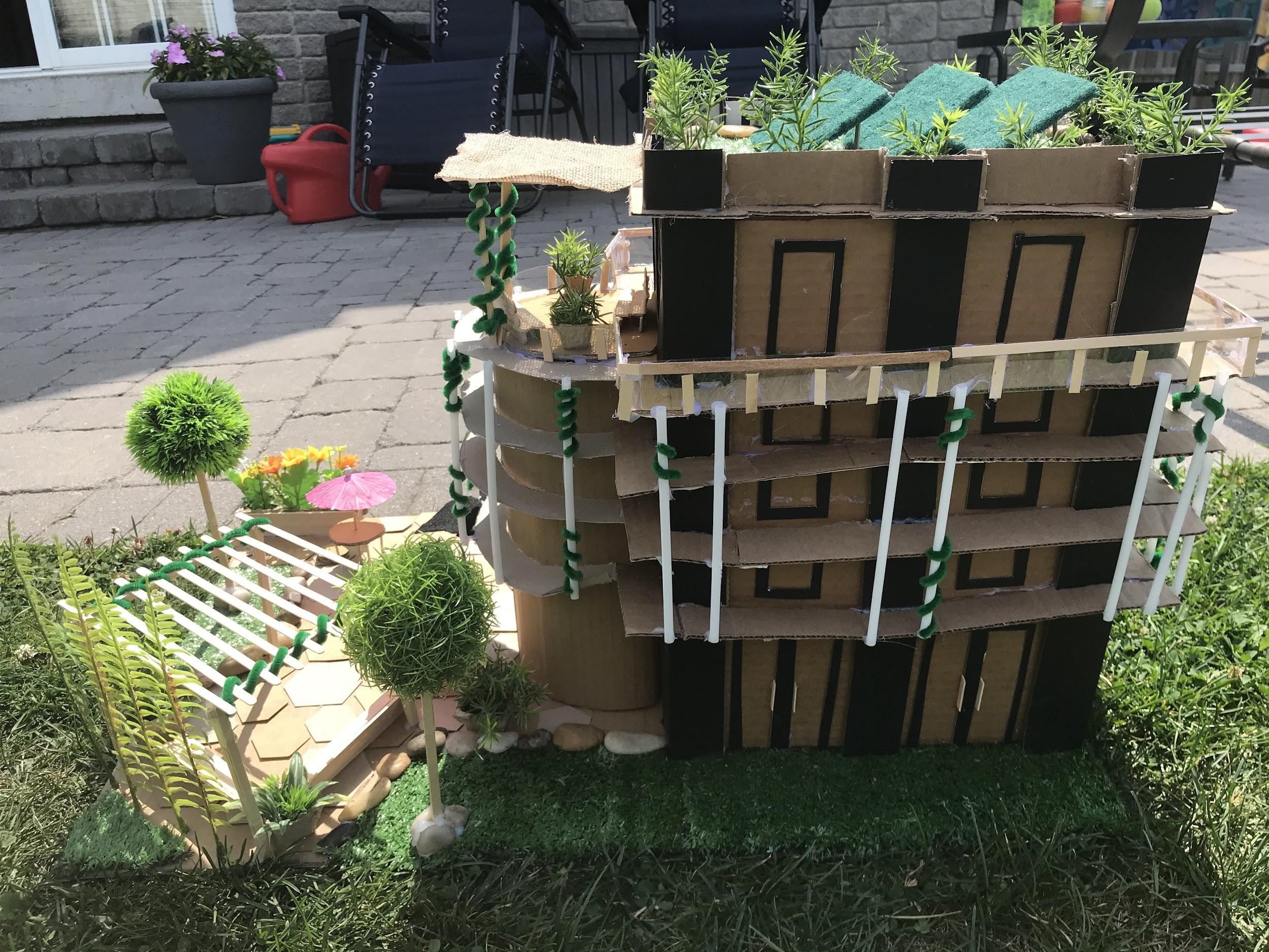
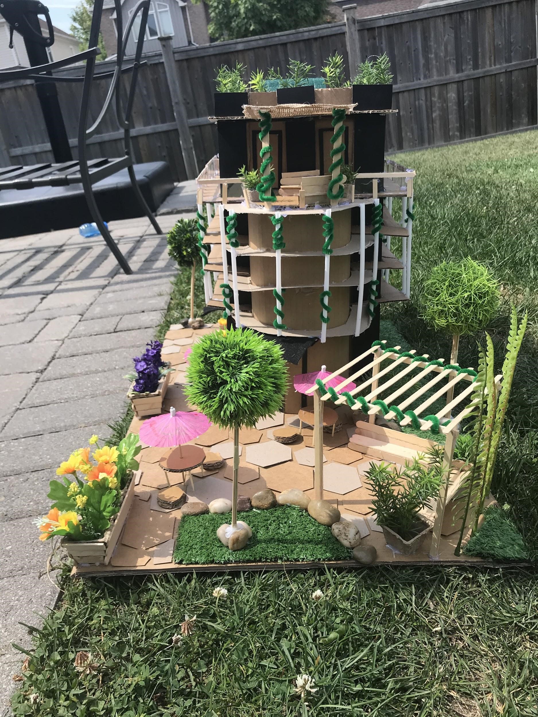
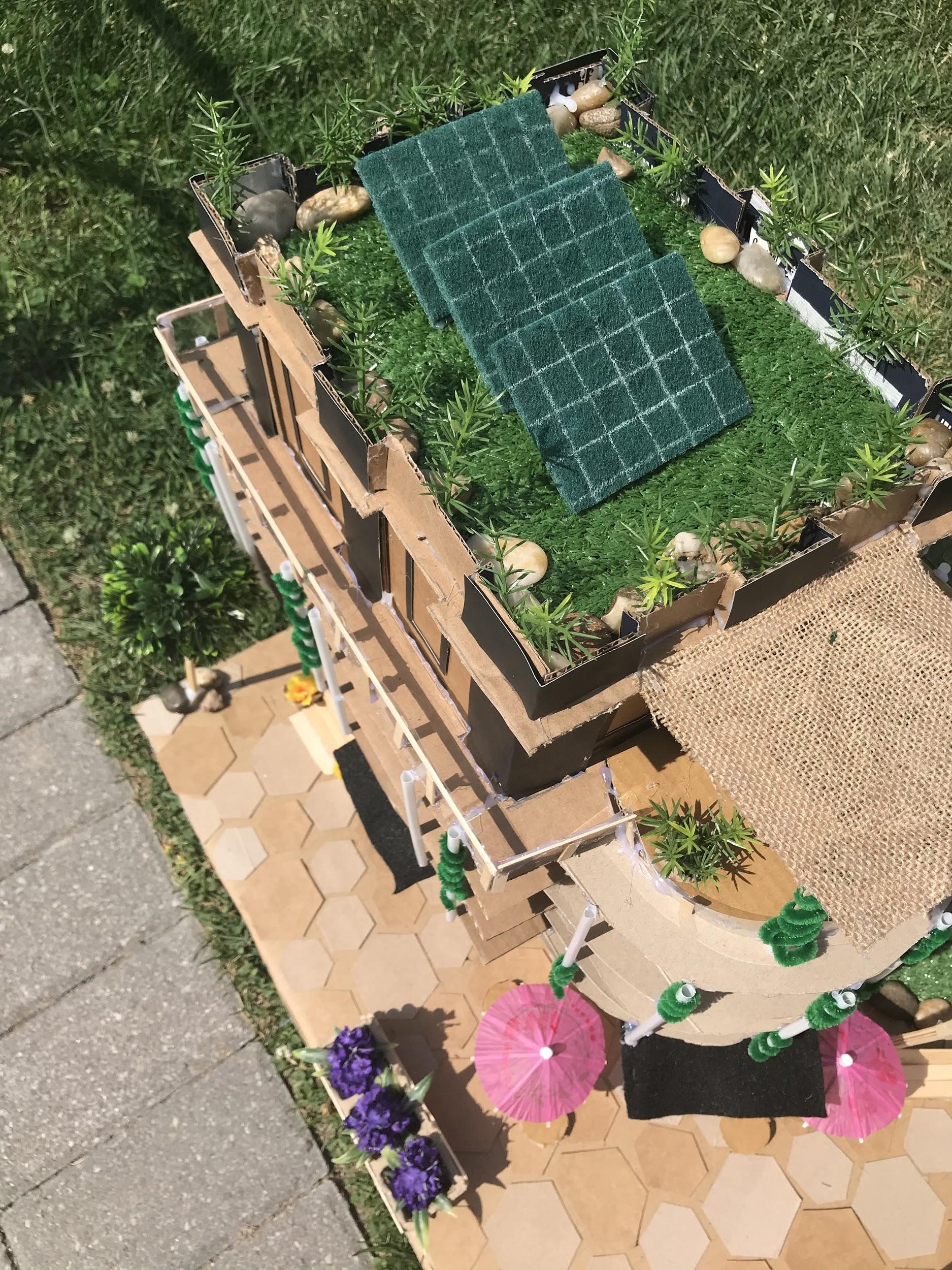
I constructed a commercial and residential, mixed use building that would be on First Avenue. I wanted to create an exhibition space to entice people into the waterfront area. It would introduce the first wow factor of the new waterfront showcase to portray the environmentally sustainable, accessible and a welcoming community space design. This approach is to carry on the vision for Vancouver’s resilience theme. The building is self preserving it features solar panels on the roof for those rare sunny days in Vancouver to provide power and it collects rainwater, to be used on the green roof and for the green courtyard area.
I wanted it to be accessible from the road to the waterfront through an open green community space. The community gathering area has a lot of space, greenery and shaded seating. The building itself is a rectangular shape with a contrasting cylindrical side, it is covered in balcony space which wraps around the building, for breathtaking views of the waterfront. The building will have a modern look and will be aesthetically pleasing, I further added support around the building to enhance interest and create visual individuality that separates the different building uses.
Daniel Russell
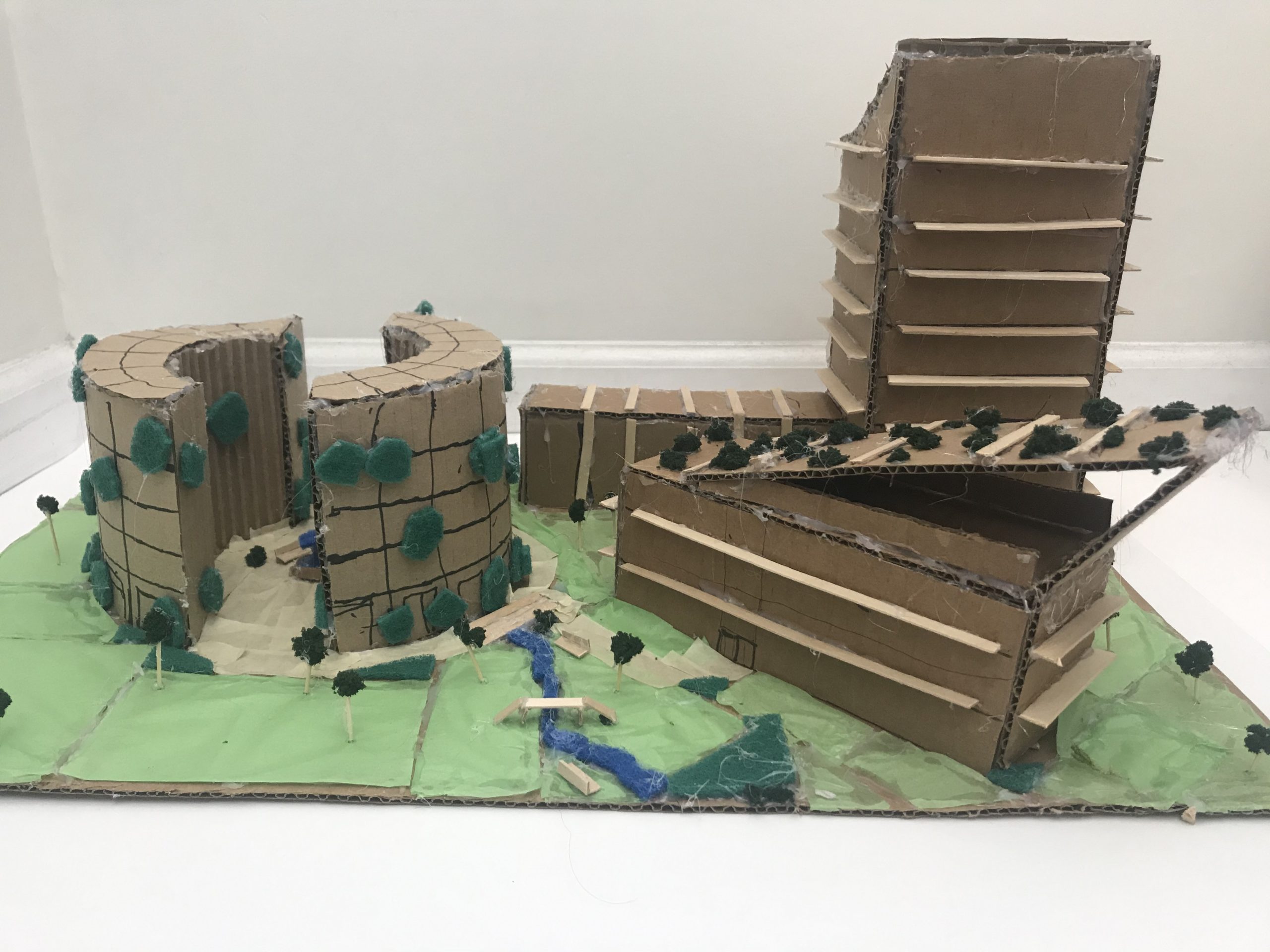
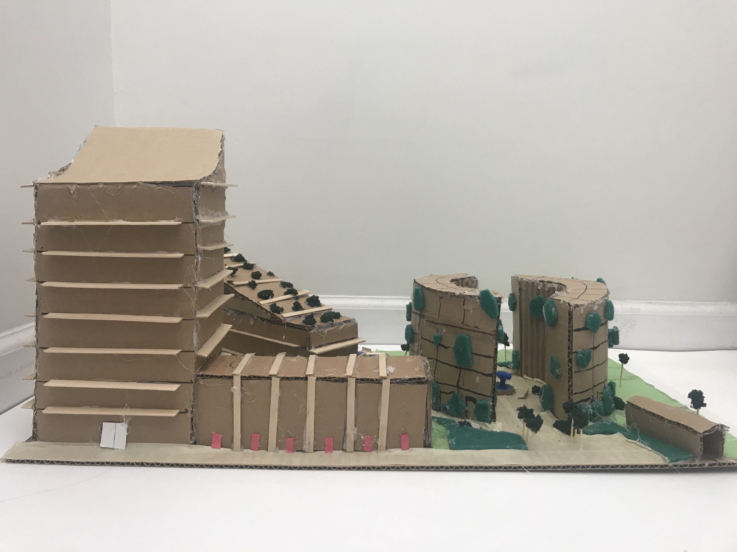
False Creek Development Plan (2020)
Cardboard, tissue paper, fake greenery, cardboard, craft sticks, hot glue, construction paper
Length: 14.5”, Width: 24”, Height: 11.75”
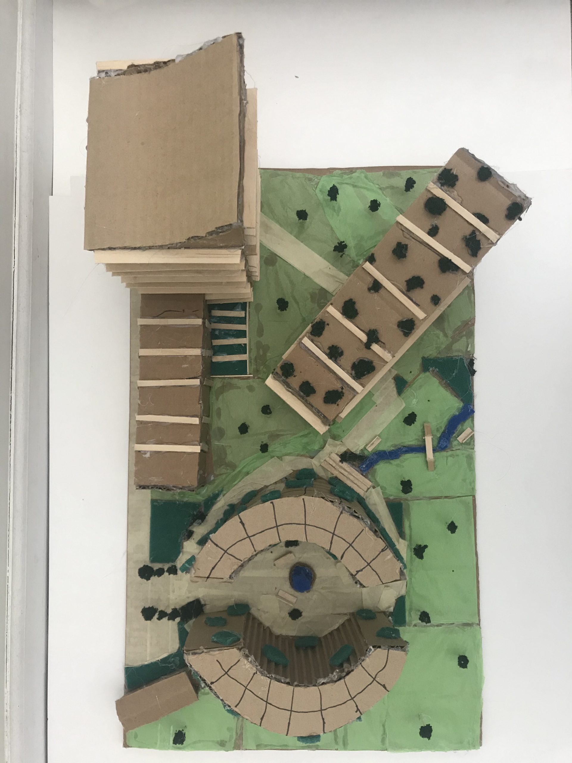
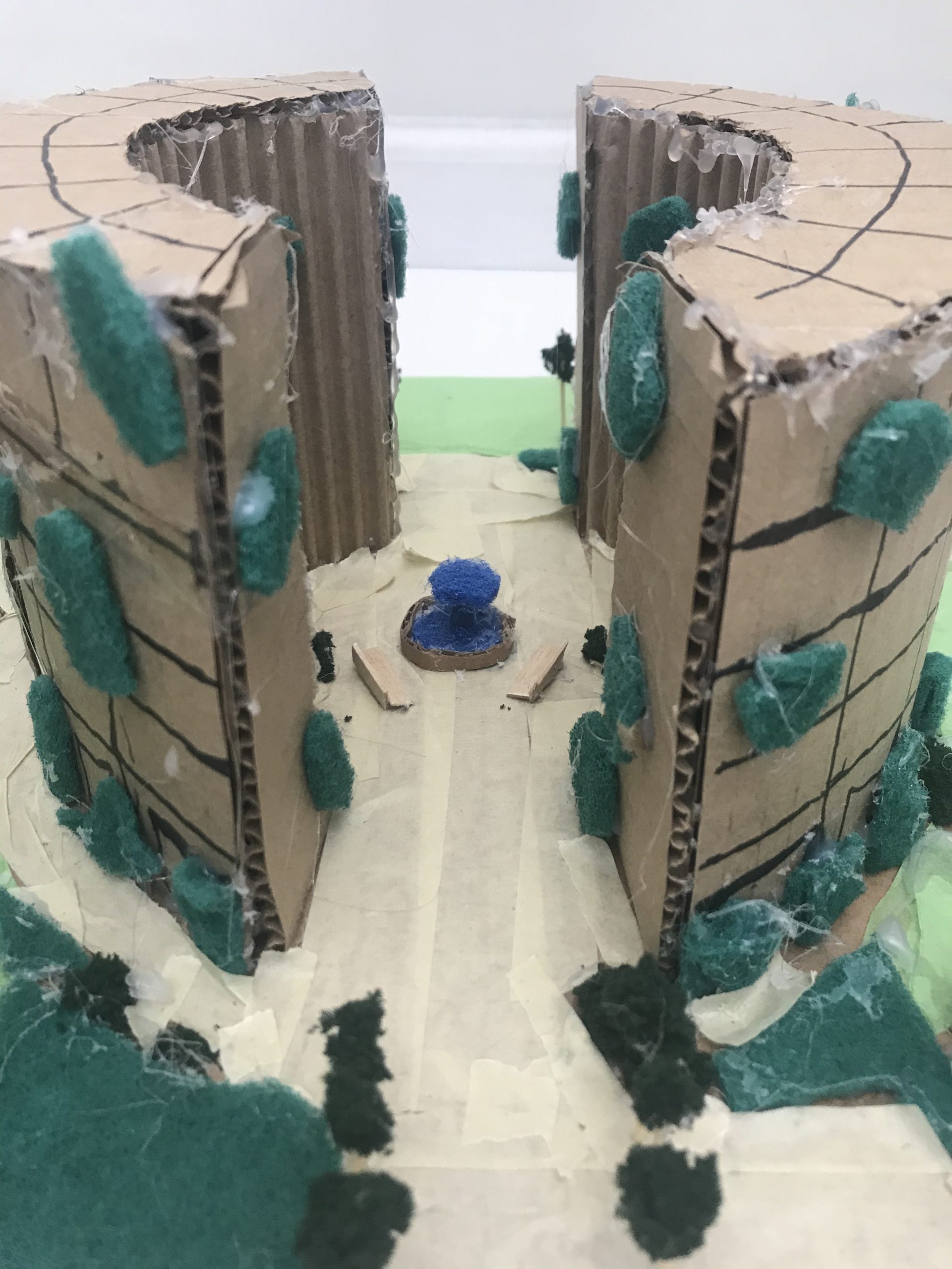
This was my plan to create a sustainable, accessible community near False Creek by Cambie Bridge in Vancouver, BC. I made sure that sunlight and views of the water are able to go through the buildings, and there is public space as well as retail and residential areas.
I added green roofs to make the buildings look and act more sustainable, as well as a public plaza, community garden, shaded canopy at the top of a building, fields, beaches, benches and seating areas. I added a wheelchair/stroller/bicycle ramp from the bridge to ground level to make the development more accessible. I left the heritage building in its place to preserve it, and the plan is for it to be restored to fit the area and have a good use.
Tara Sangra
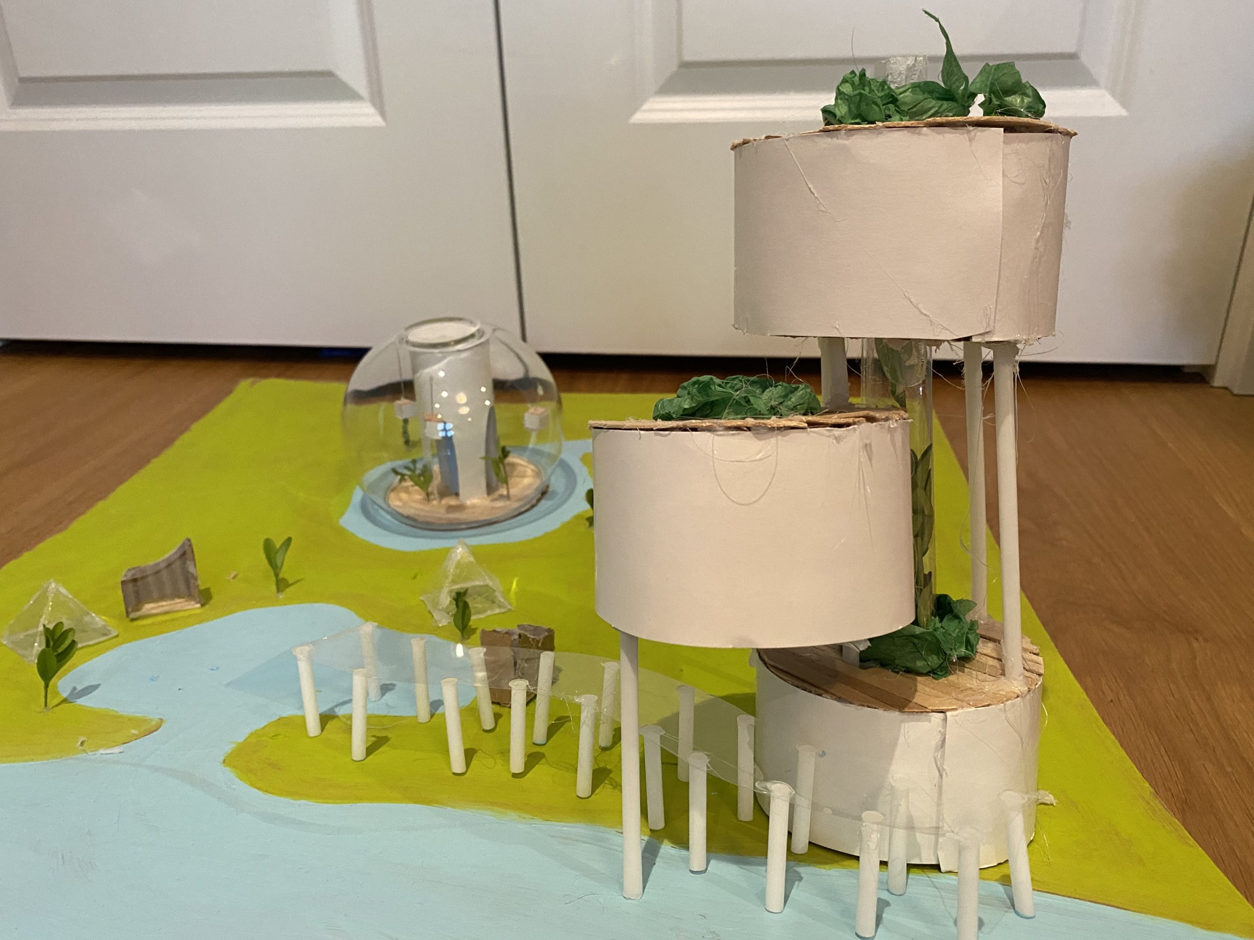
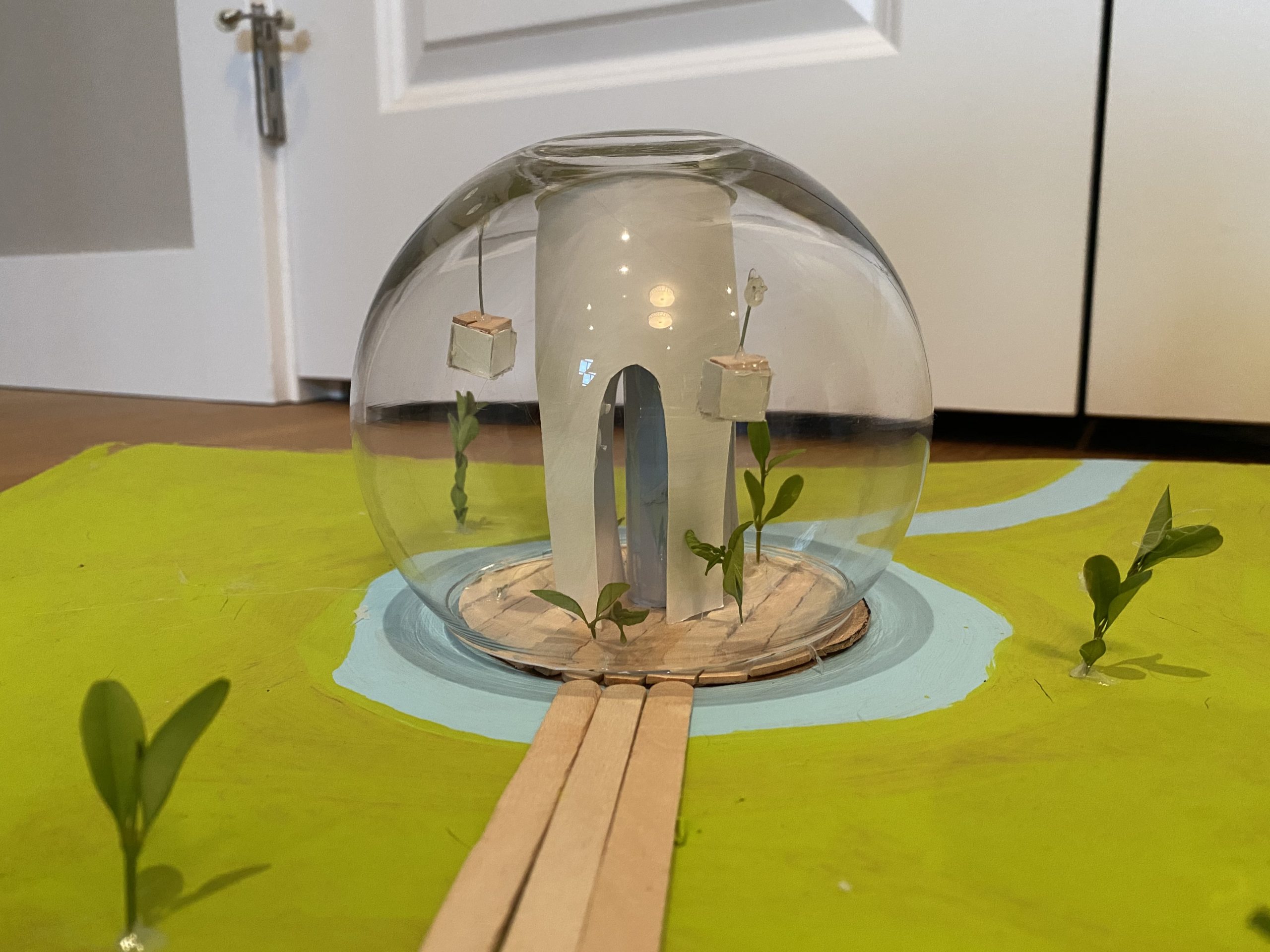
Sustainable Site Plan (2020)
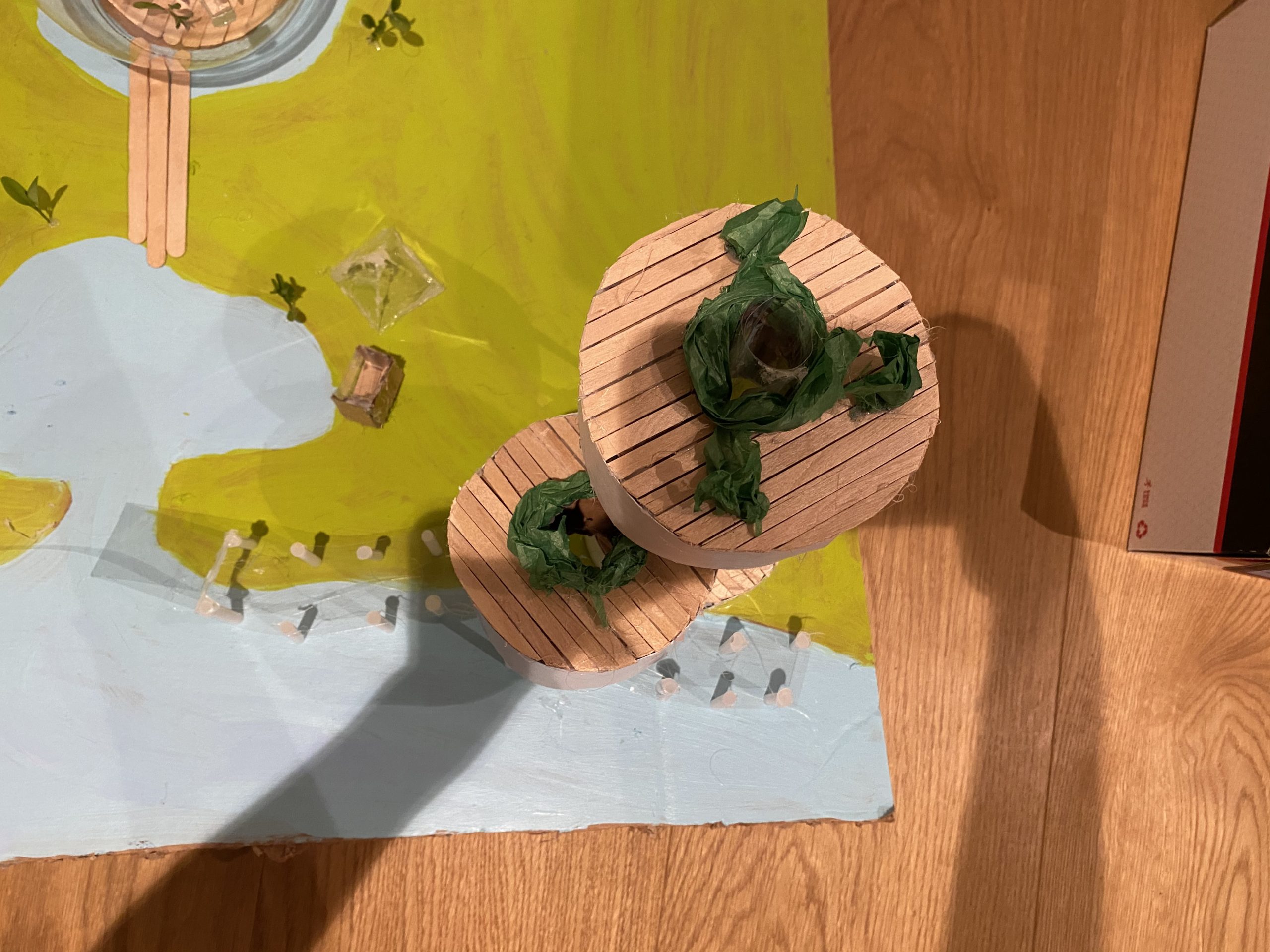
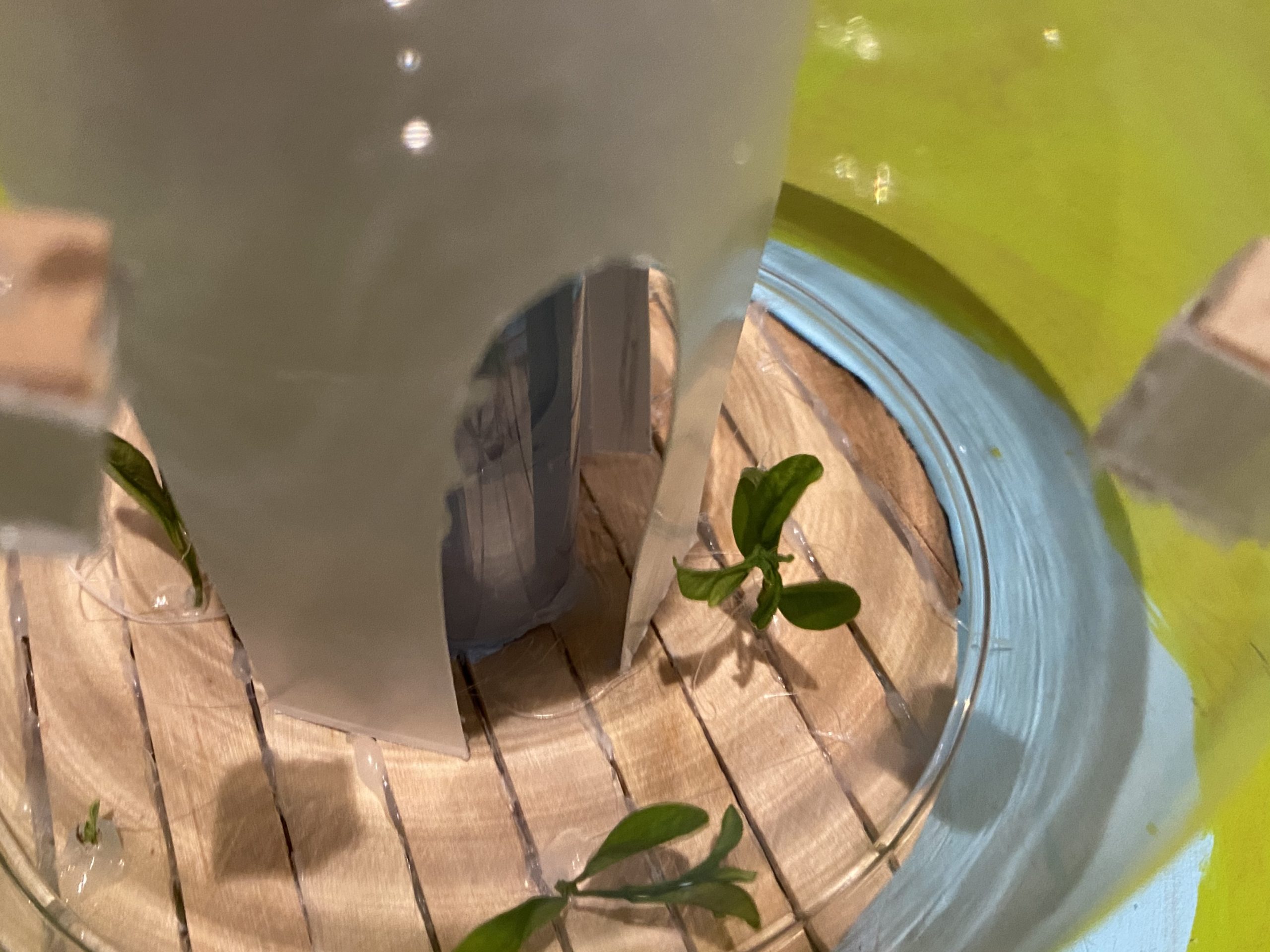
While designing this site I took into consideration what would be sustainable, useable, and out of the ordinary. All of the buildings on this site have an element of the outdoors brought inside. The cylindrical building has a tube filled with greenery which provides a natural way to keep the building cool.
The bubble building also has greenery on the floor of the building to help naturally cool the air. On top of indoor greenery the cylindrical buying includes rooftop gardens where residents of the building have a community garden. The Seawall in the site is raised above so that rising sea levels won’t affect the path, and it is also clear so that people can observe marine life.
Joshua Taylor
X on False Creek (2020)
3D model on cardboard, 58 x 62 cm, 1:100
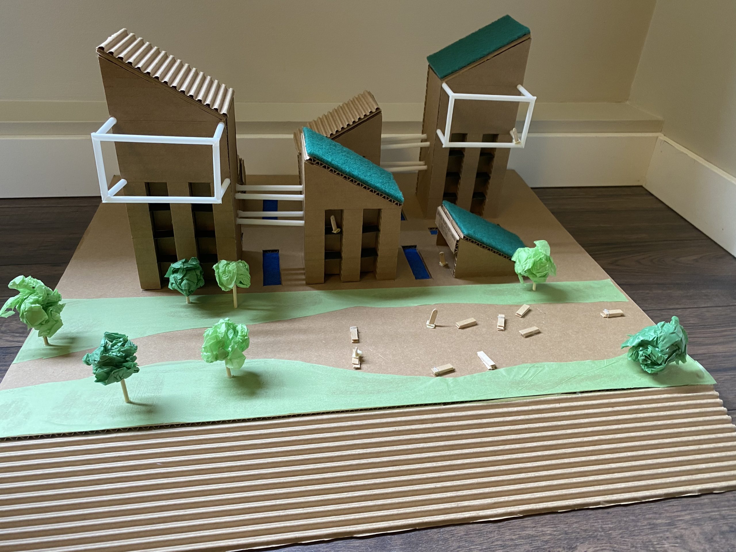
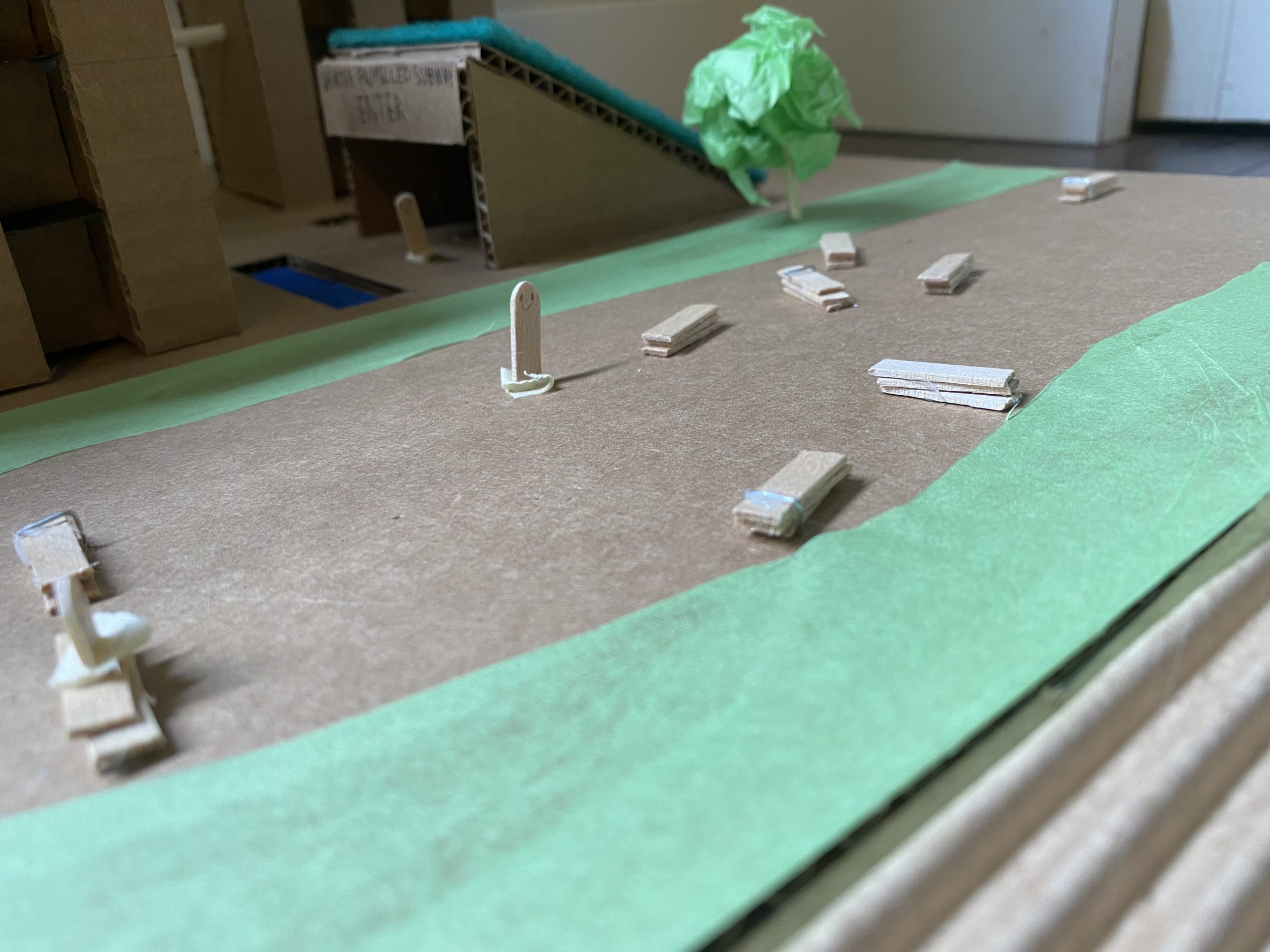
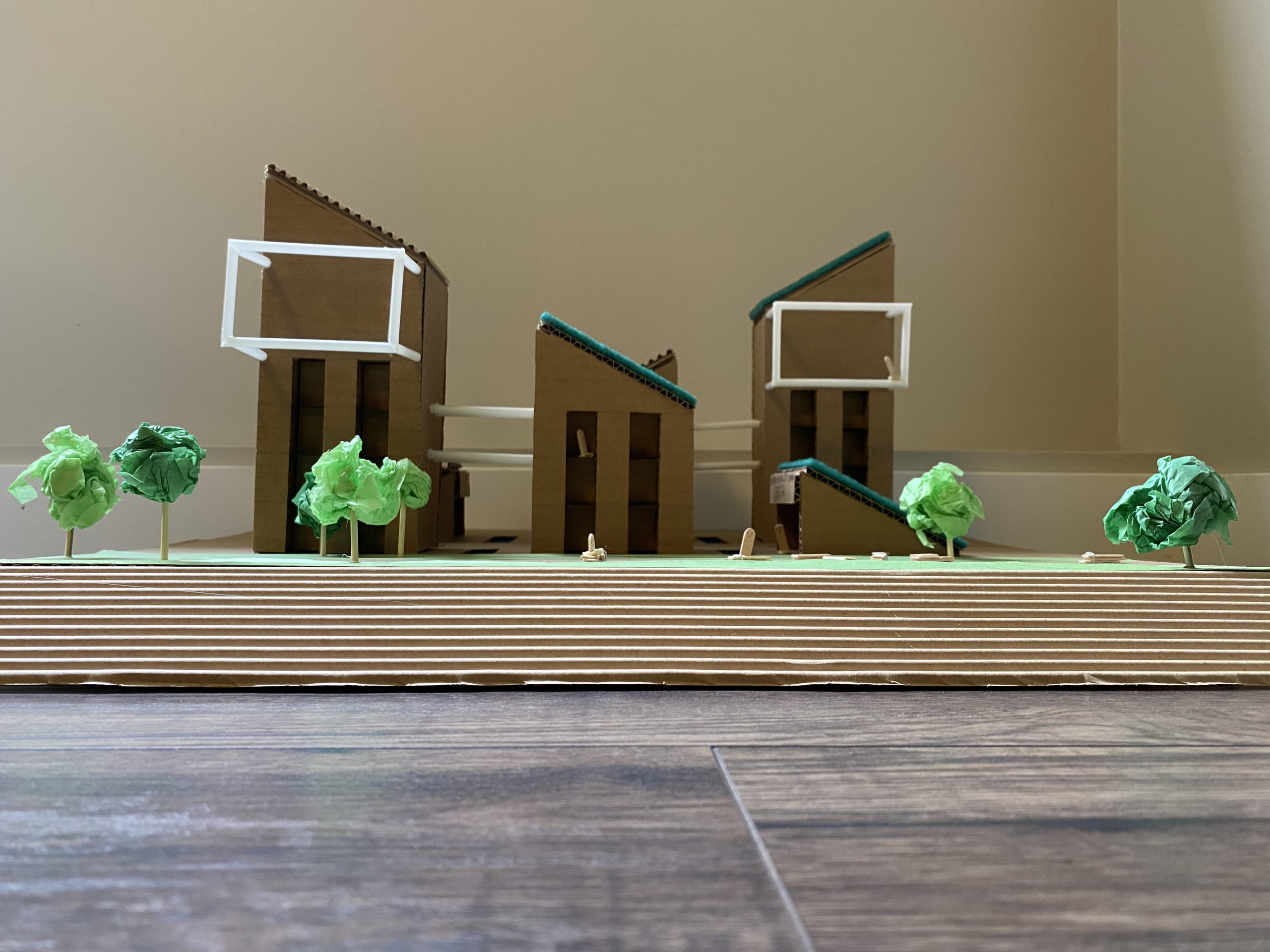
The overall goal of this project was to fast forward to 2050 and find out ways to build on land that is at risk of water level rise. I started by pushing everything on the site back and then adding a ramp for the water to slowly rise up. For my building I went for a series of small residential towers with solar panels and green rooves that filter and store rainwater for sewage.
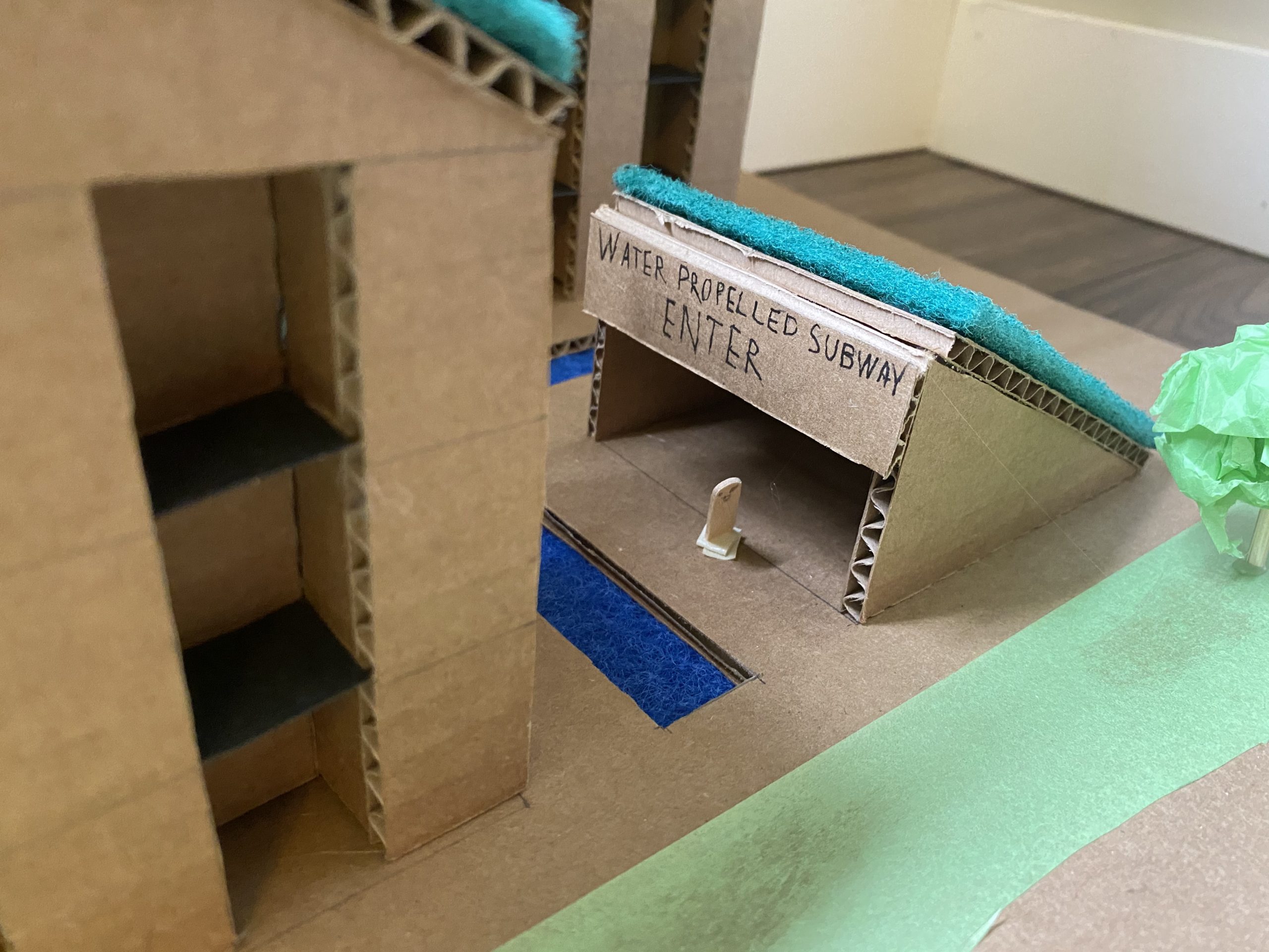
On each of the taller towers there is a giant glass recreational room for all the residents that overlooks the water, and seaside path with industrial styled benches. There was originally a creek that travelled alongside the left of the property so I decided to let that peek out from in between the towers for entertainment as fish may swim through these waterways. Lastly the shortest buildings are entrances to an underground water-propelled subway that connects to the Canada line and doubles as a tourist attraction.
Ghazal Torkaman
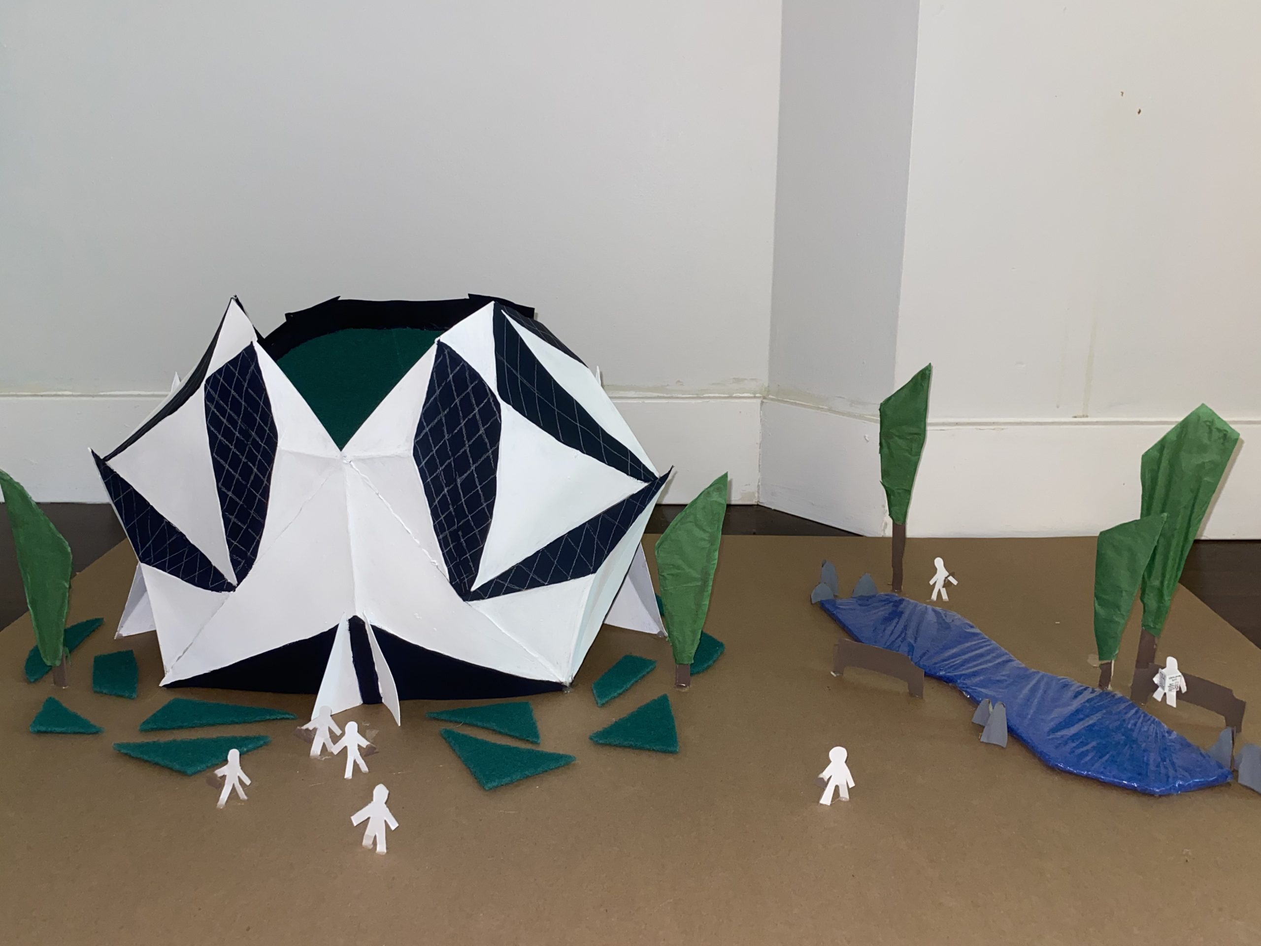
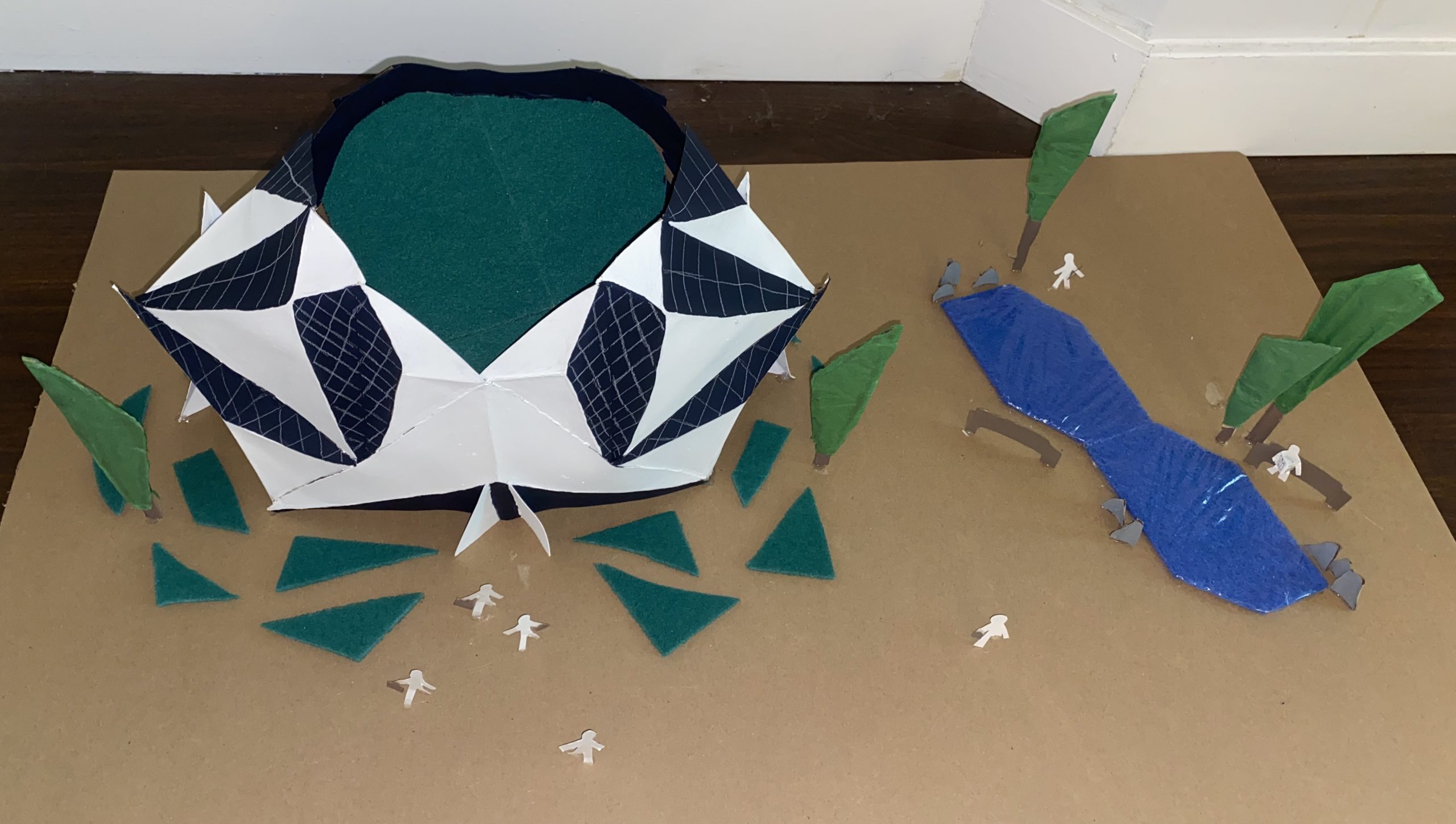
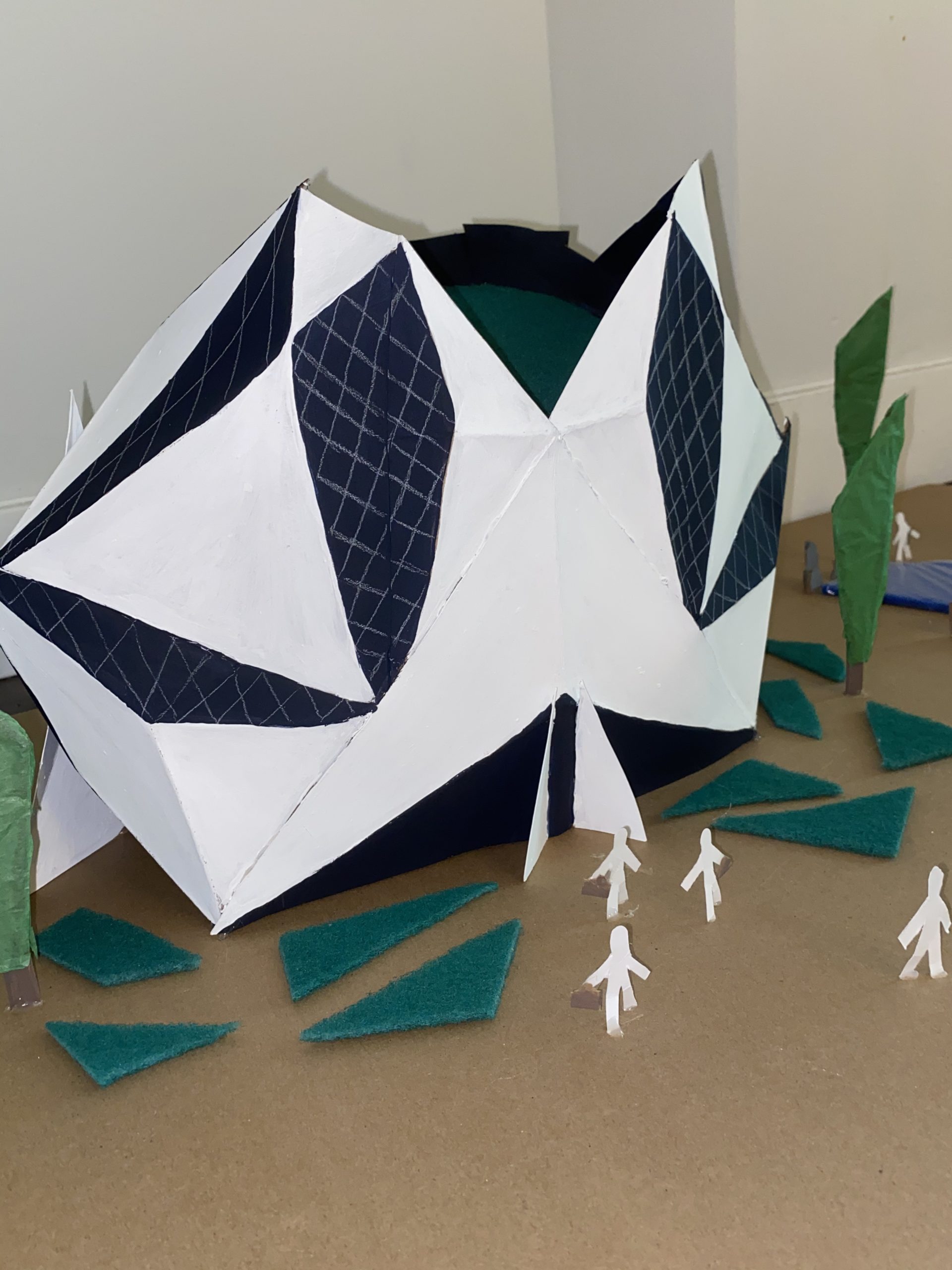
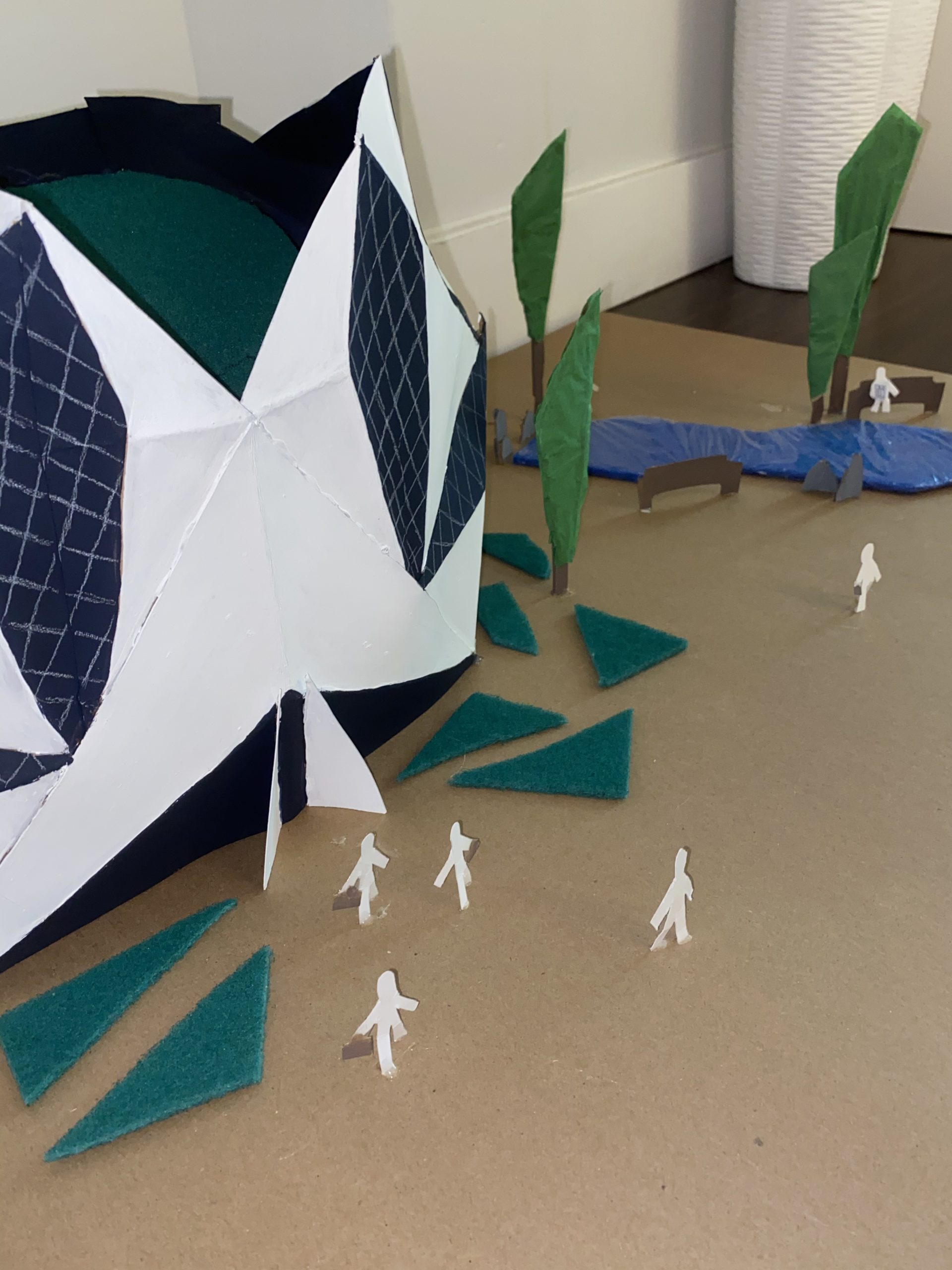
This model displays a creative twist on a modern office building, made to make the day to day work life a little more enjoyable. Due to the building’s great size, shape, and the large green roof, it is visible from the Cambie Street Bridge and very hard to miss. The shape of the building was inspired by natural elements such as rocks and minerals and the sharp points at the top of the building pay tribute to the beautiful mountains British Columbia is known for.
Inspired by the Micheal Lee Chin Crystal, the shape of the building displays different geometric shapes with white panels, glass, and solar panels as well as a geometric landscape design. The building neighbours a pond with a lot of seating areas allowing for circulation within the site.
